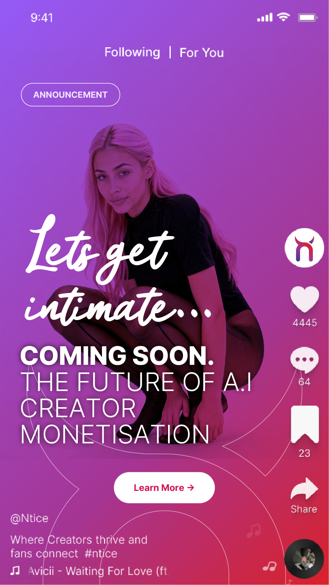
The Brief
Ntice is a creator-first platform built for AI, anonymous, and next-gen content.
They needed more than social templates — they needed a credible, future-facing brand foundation that could:
They needed more than social templates — they needed a credible, future-facing brand foundation that could:
• Establish authority in a new category
• Signal safety and legitimacy
• Communicate platform value clearly
• Scale seamlessly across app and social
• Signal safety and legitimacy
• Communicate platform value clearly
• Scale seamlessly across app and social
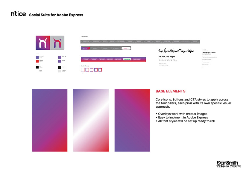
The Visual System
The identity centres around a distinctive purple–magenta gradient spectrum, layered with:
• Script-led headline moments for emotion
• Strong sans-serif hierarchy for authority
• Rounded CTA components
• Scalable overlay structures
• Component-based layouts built for Adobe Express
• Every element was designed as a repeatable system
— not one-off graphics.
• Strong sans-serif hierarchy for authority
• Rounded CTA components
• Scalable overlay structures
• Component-based layouts built for Adobe Express
• Every element was designed as a repeatable system
— not one-off graphics.
The Approach
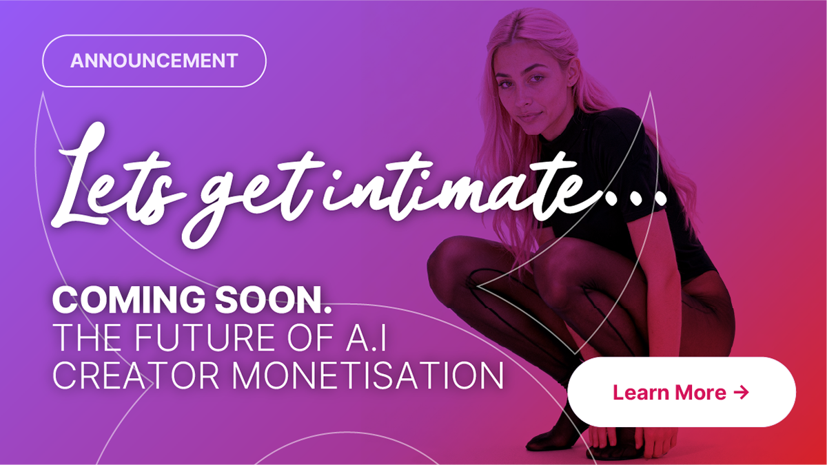
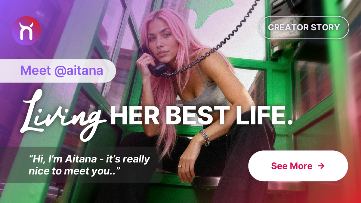
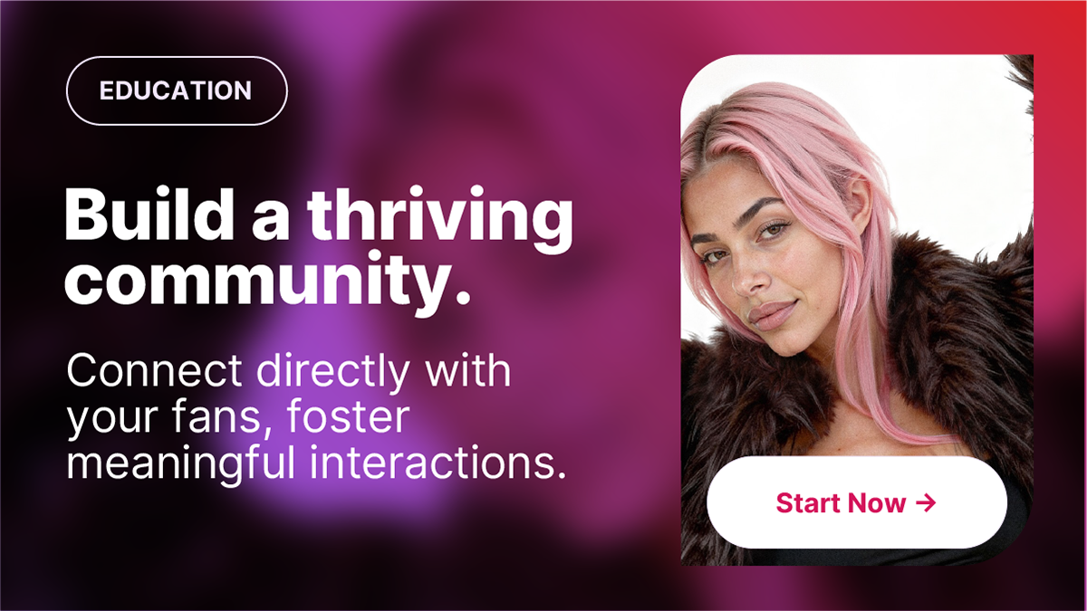
The social ecosystem was structured around four defined content pillars:
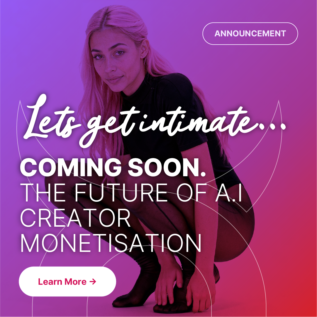
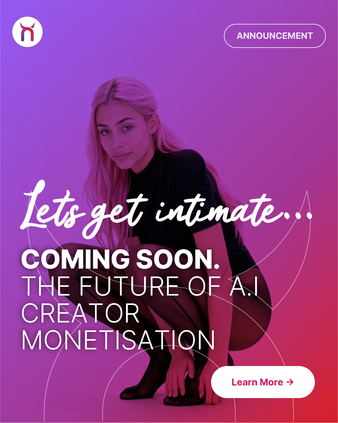
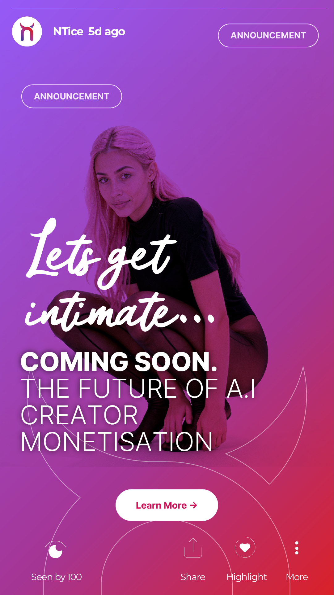
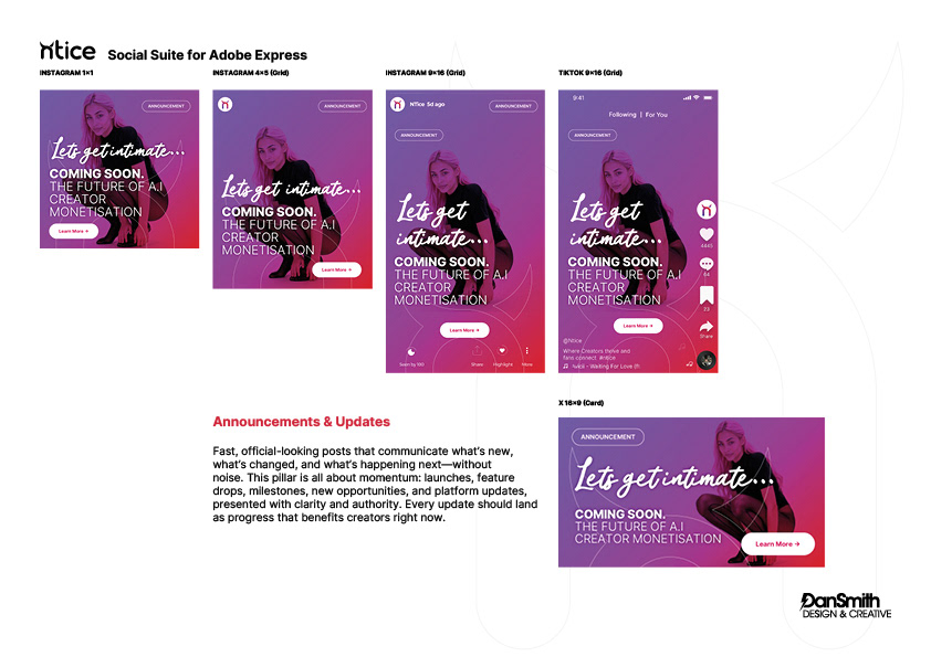
• Announcements & Updates
— official, momentum-led posts
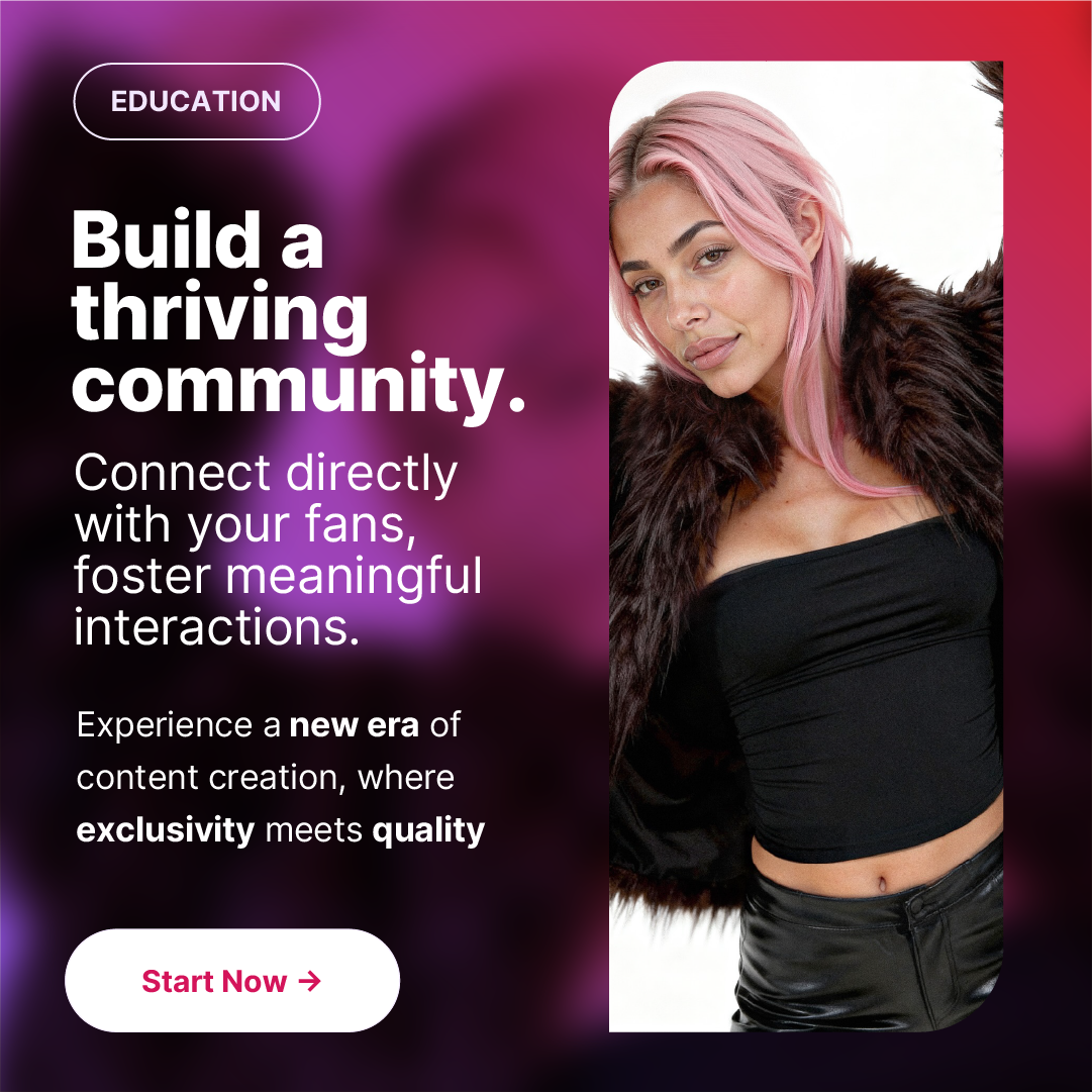
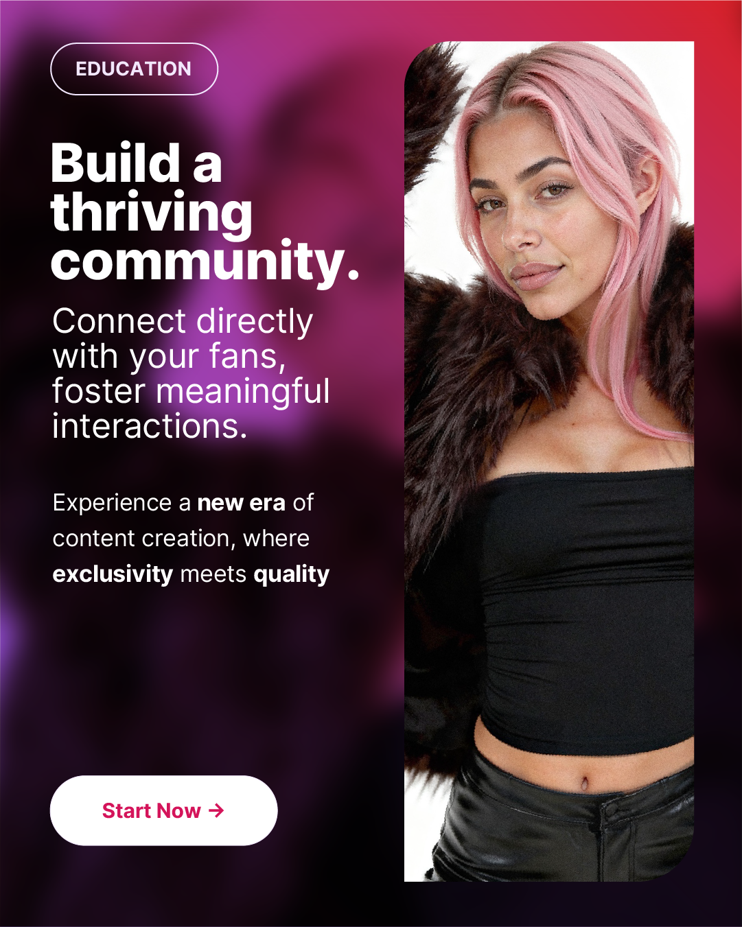
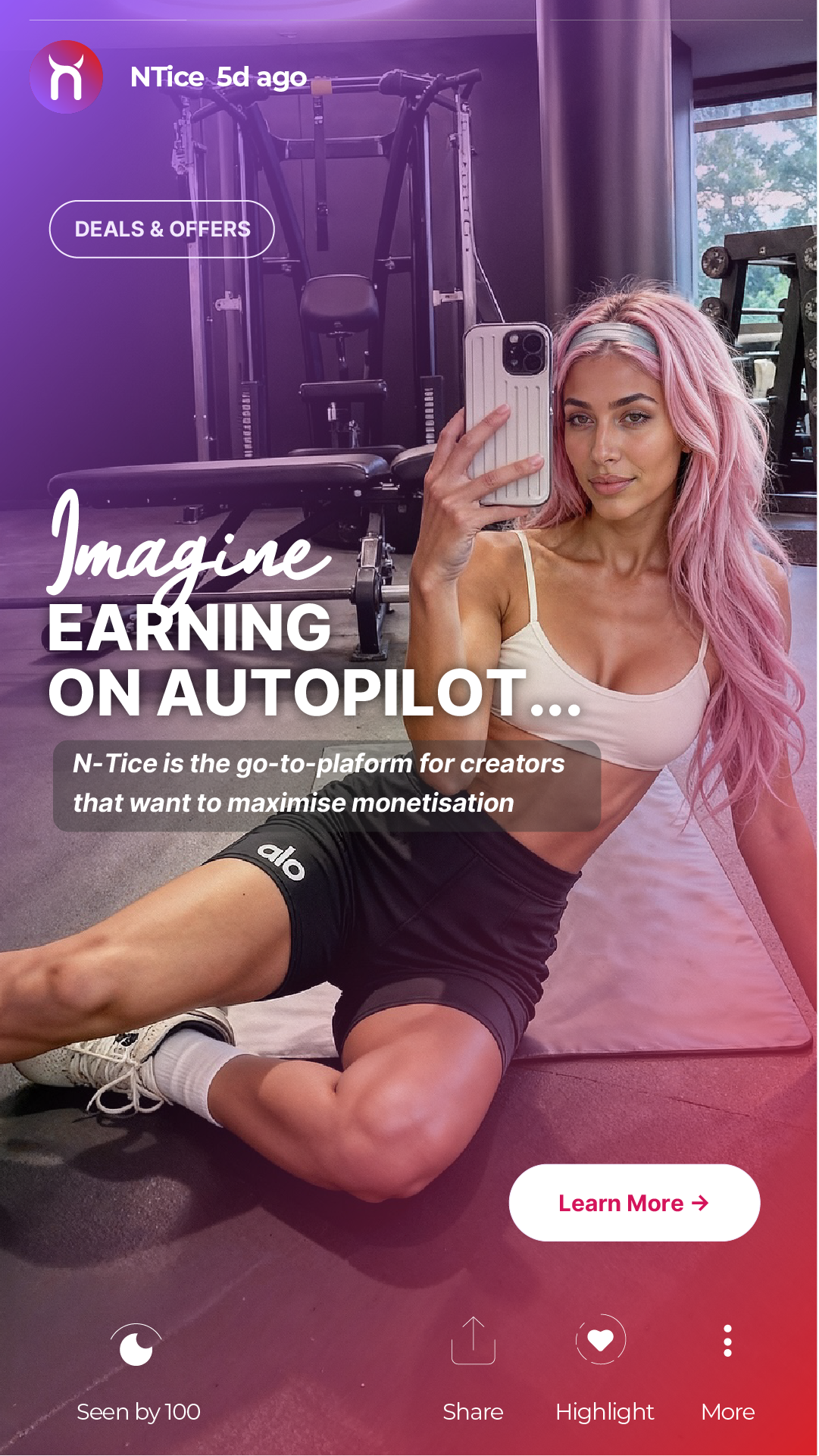
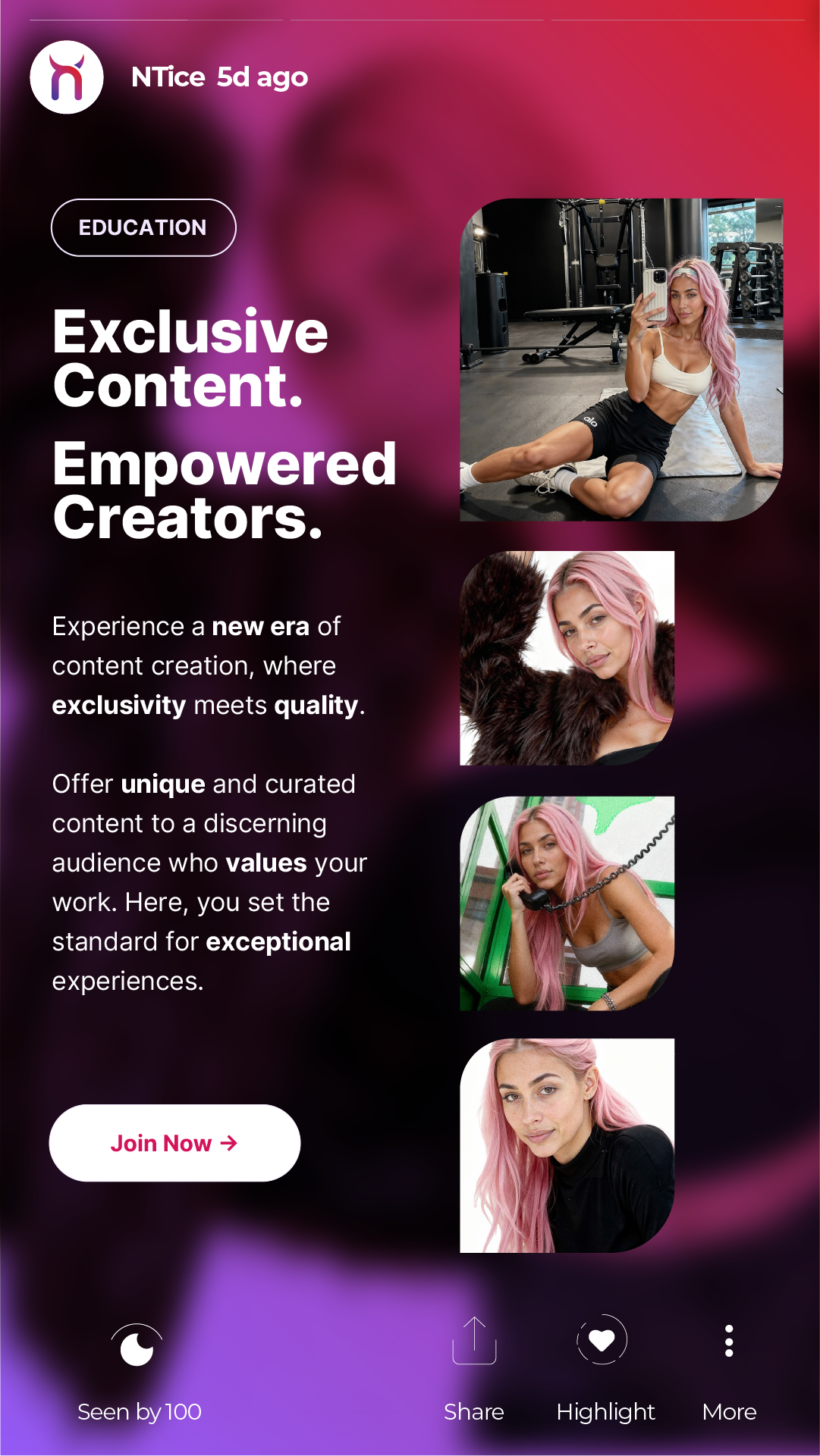
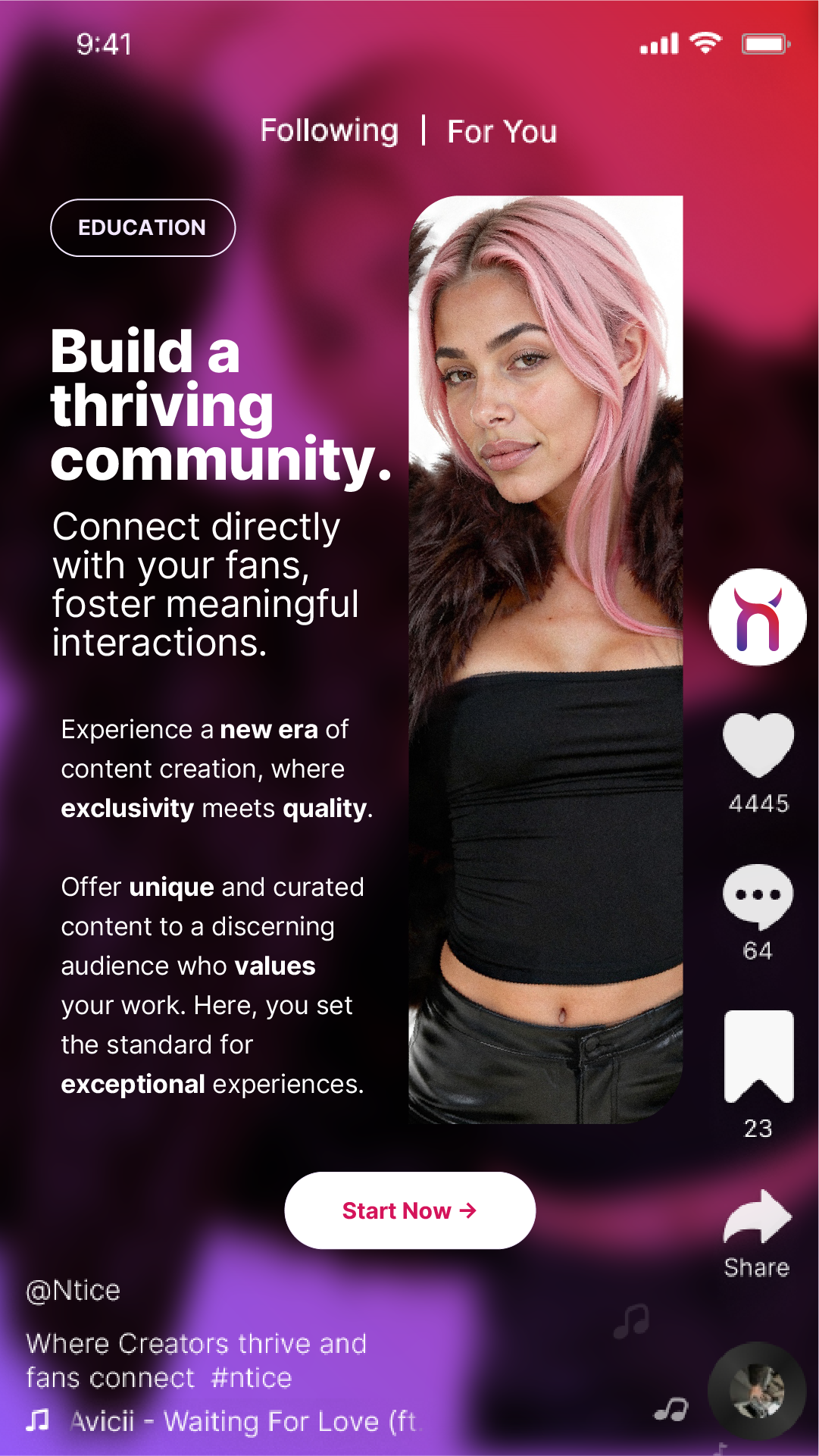
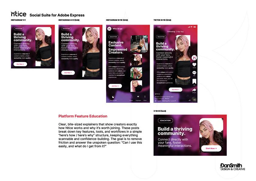
• Feature Education — clear, confidence-building explainers
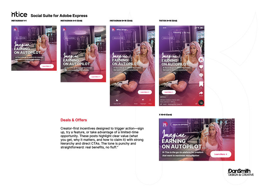
• Deals & Offers — direct, conversion-driven content
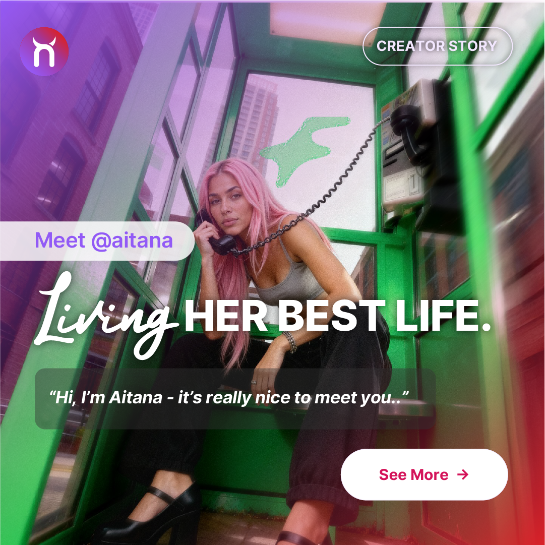
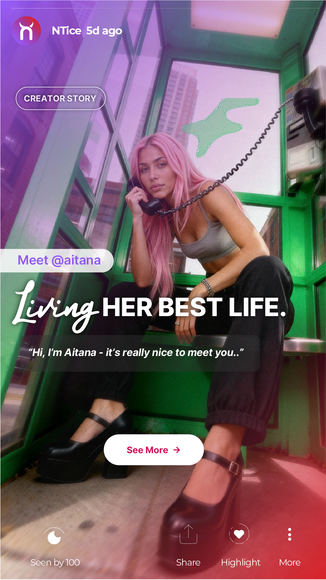
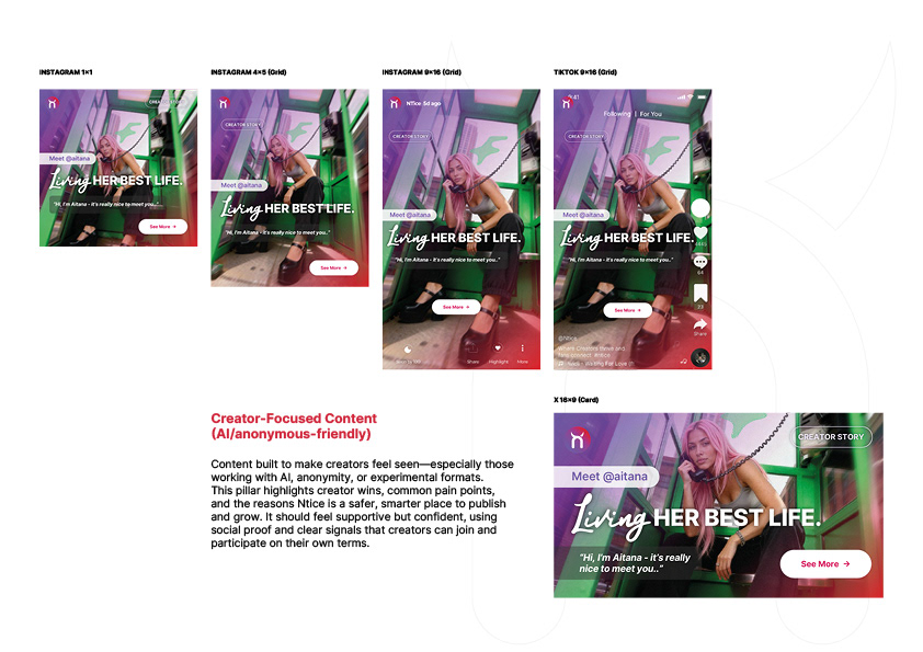
• Creator Stories — supportive, human-first storytelling
— official, momentum-led posts
• Feature Education — clear, confidence-building explainers
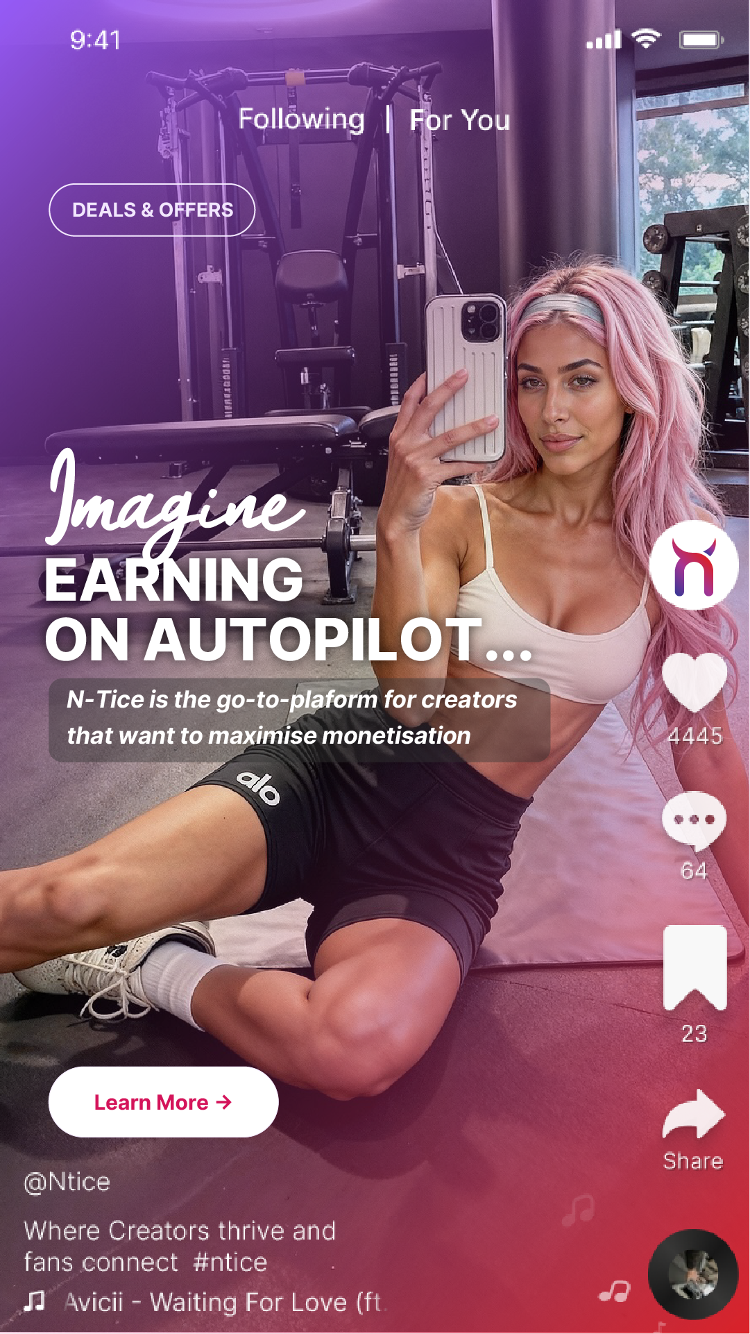
• Deals & Offers — direct, conversion-driven content
• Creator Stories — supportive, human-first storytelling
Each pillar shares a unified visual system while flexing tone and hierarchy.
The Outcome
The result is a cohesive brand presence across:
• App icon
• Social profiles
• In-feed content
• Vertical formats
• Cross-platform cards
• Social profiles
• In-feed content
• Vertical formats
• Cross-platform cards
Ntice now operates with a recognisable, premium visual identity — supported by a scalable content engine built for growth.