Overview
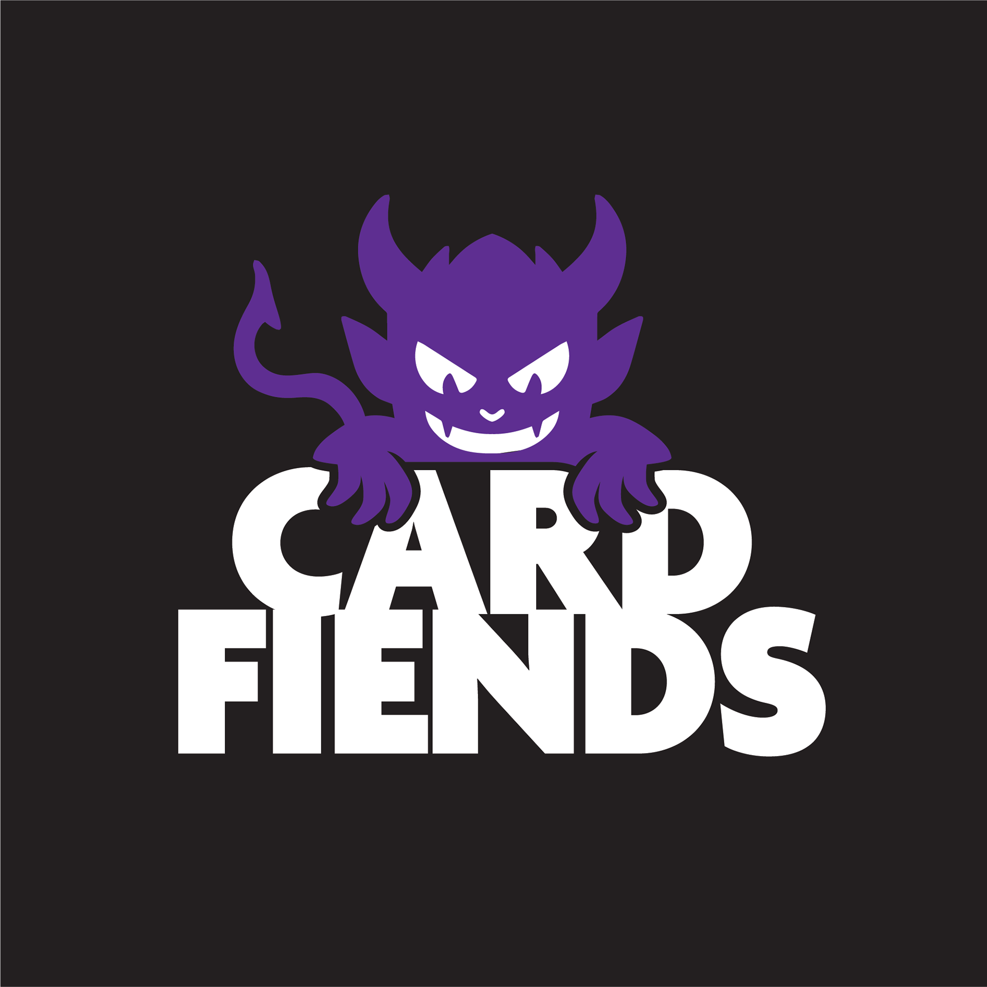
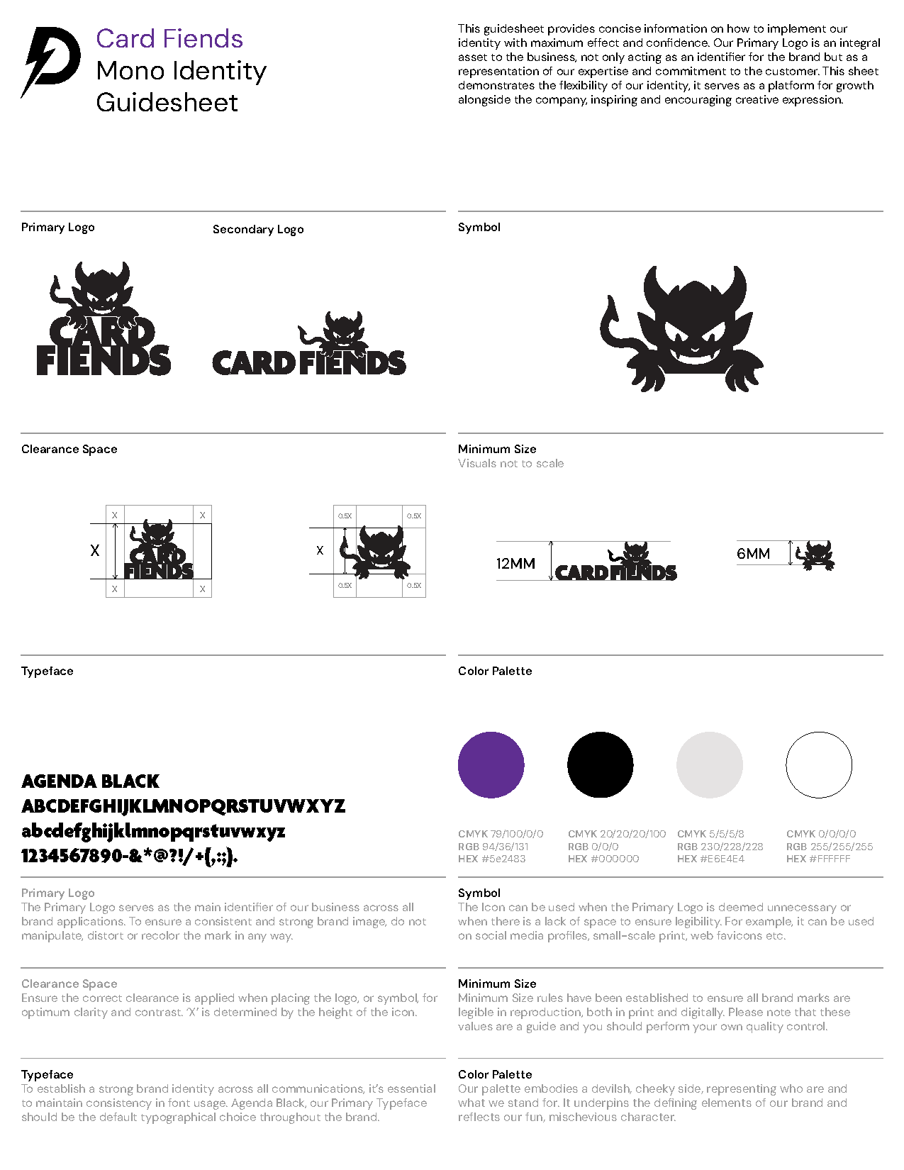
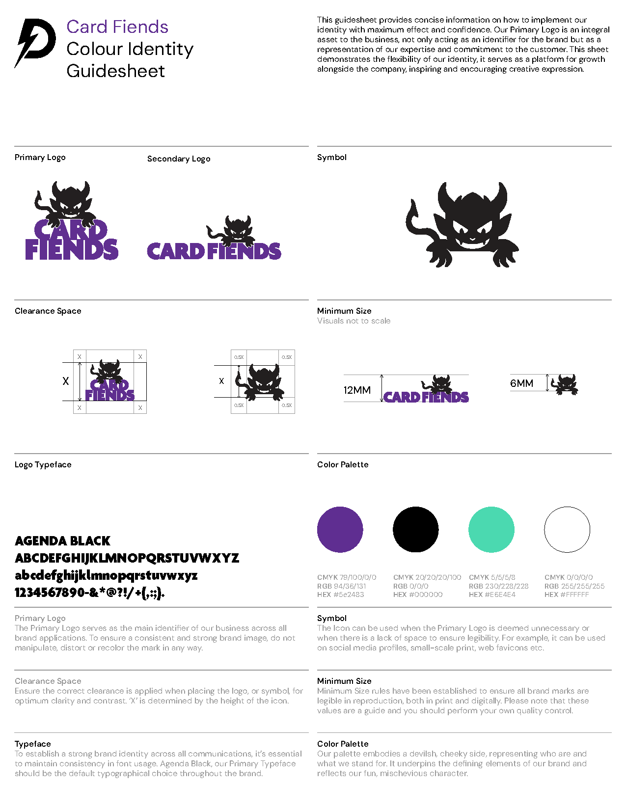
Card Fiends is a trading card retailer focused on collectible and competitive card games. The brief was to create a bold, character-led identity that could stand out within the vibrant trading card community while remaining flexible across digital platforms, merchandise and marketing materials.
Card Fiends is a trading card retailer focused on collectible and competitive card games. The brief was to create a bold, character-led identity that could stand out within the vibrant trading card community while remaining flexible across digital platforms, merchandise and marketing materials.

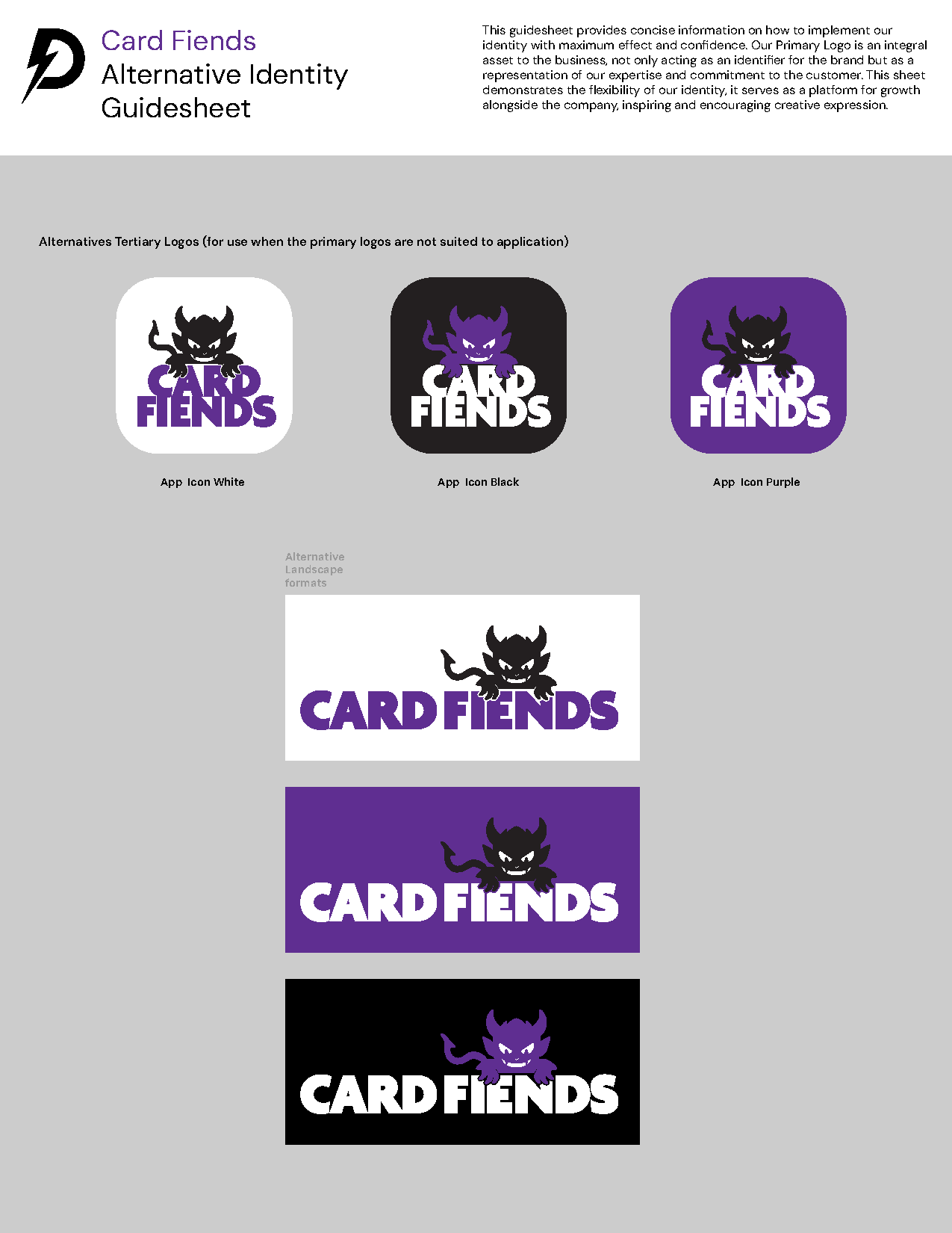
Identity System
The fiend character forms the core of the brand identity, integrated directly into the wordmark to create an instantly recognisable logo. A flexible logo system allows the mark to adapt across different formats, from primary brand use to compact symbol applications for digital spaces.
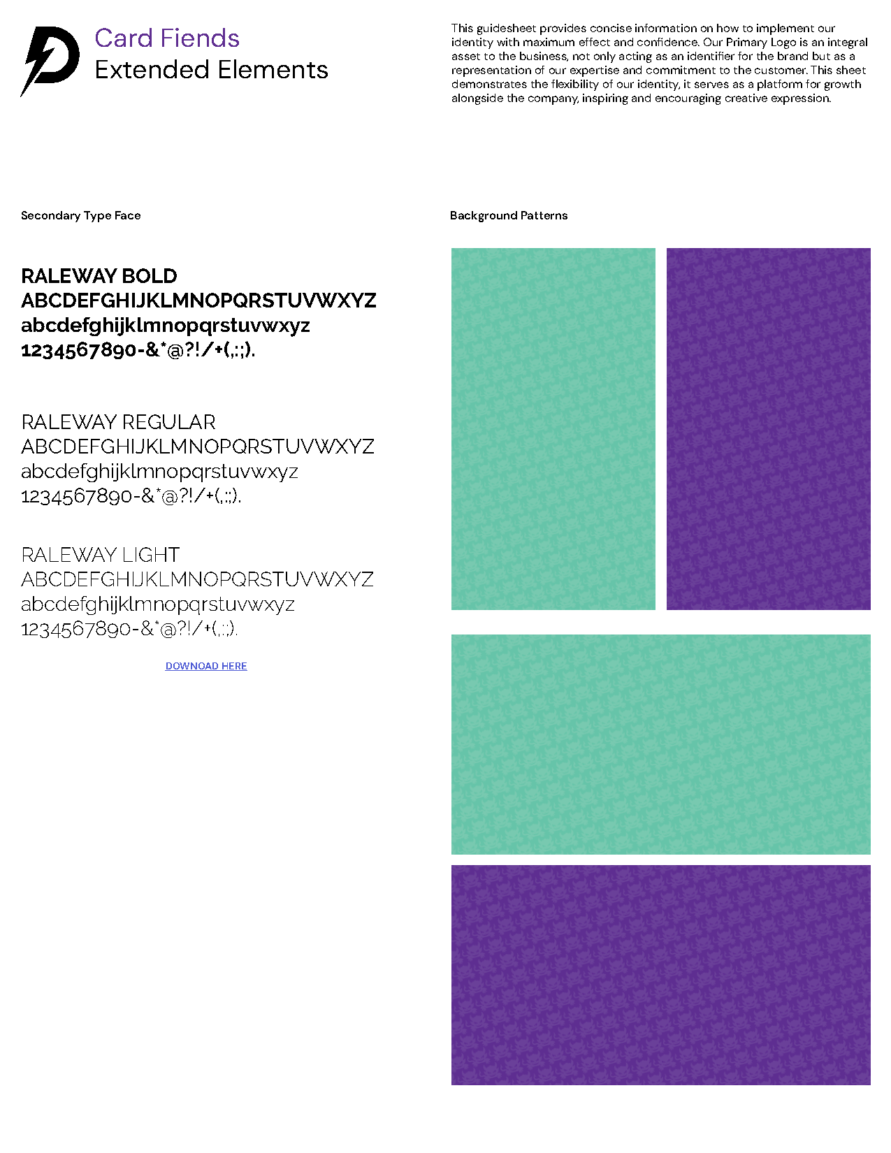
Colour & Typography
A bold purple-led palette supported by black, white and mint green accents creates strong visual contrast while reinforcing the playful tone of the brand. A clear typographic hierarchy ensures the identity remains consistent across communications.
Extended Elements
Supporting graphic patterns and visual textures were developed to extend the brand beyond the logo, creating a cohesive visual language across marketing materials and digital content.
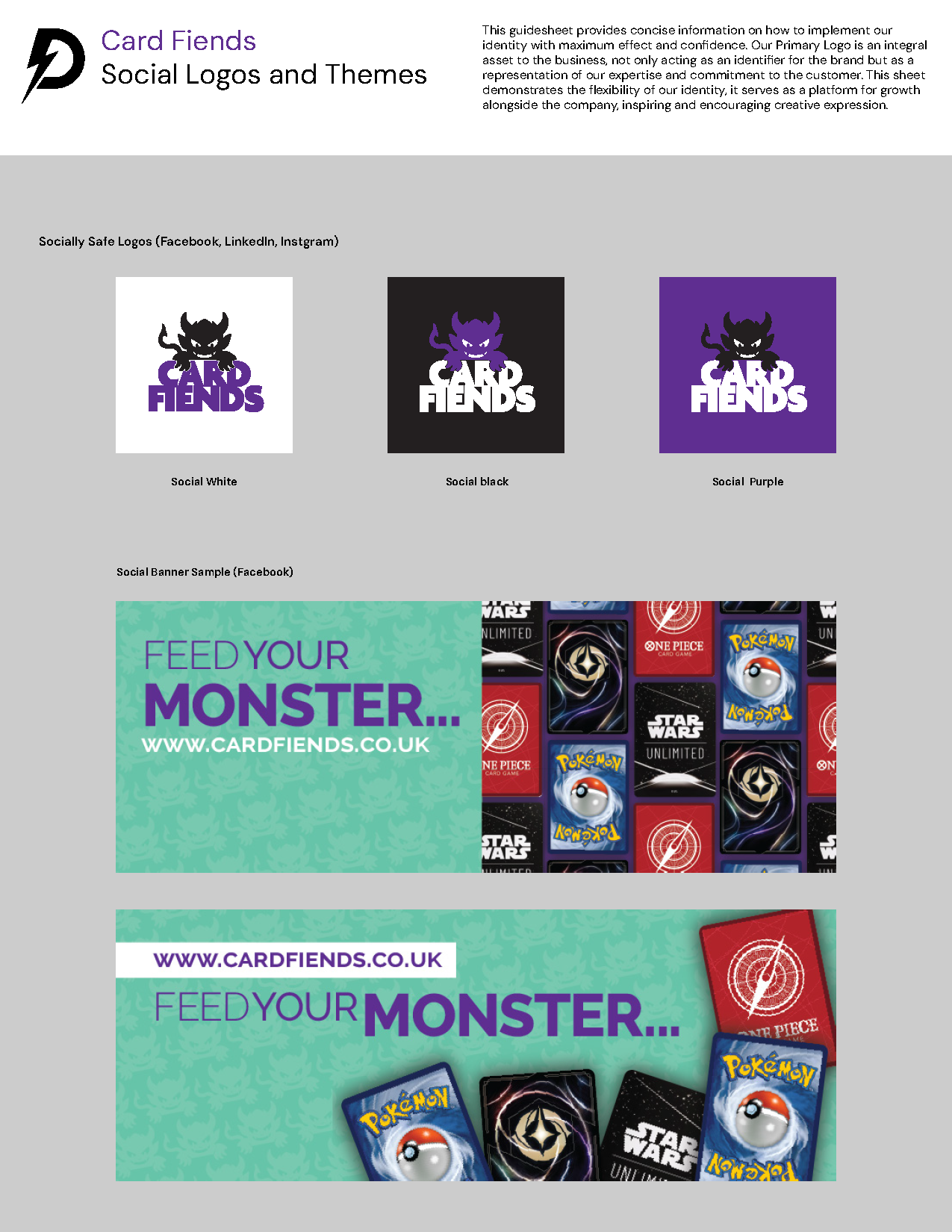
Digital Applications
The system includes adaptable assets for social media, banners and promotional graphics, ensuring a consistent brand presence across digital platforms.
Outcome
The final identity delivers a distinctive and scalable visual system that captures the playful energy of trading card culture while providing a flexible framework for future growth.
Social Icons