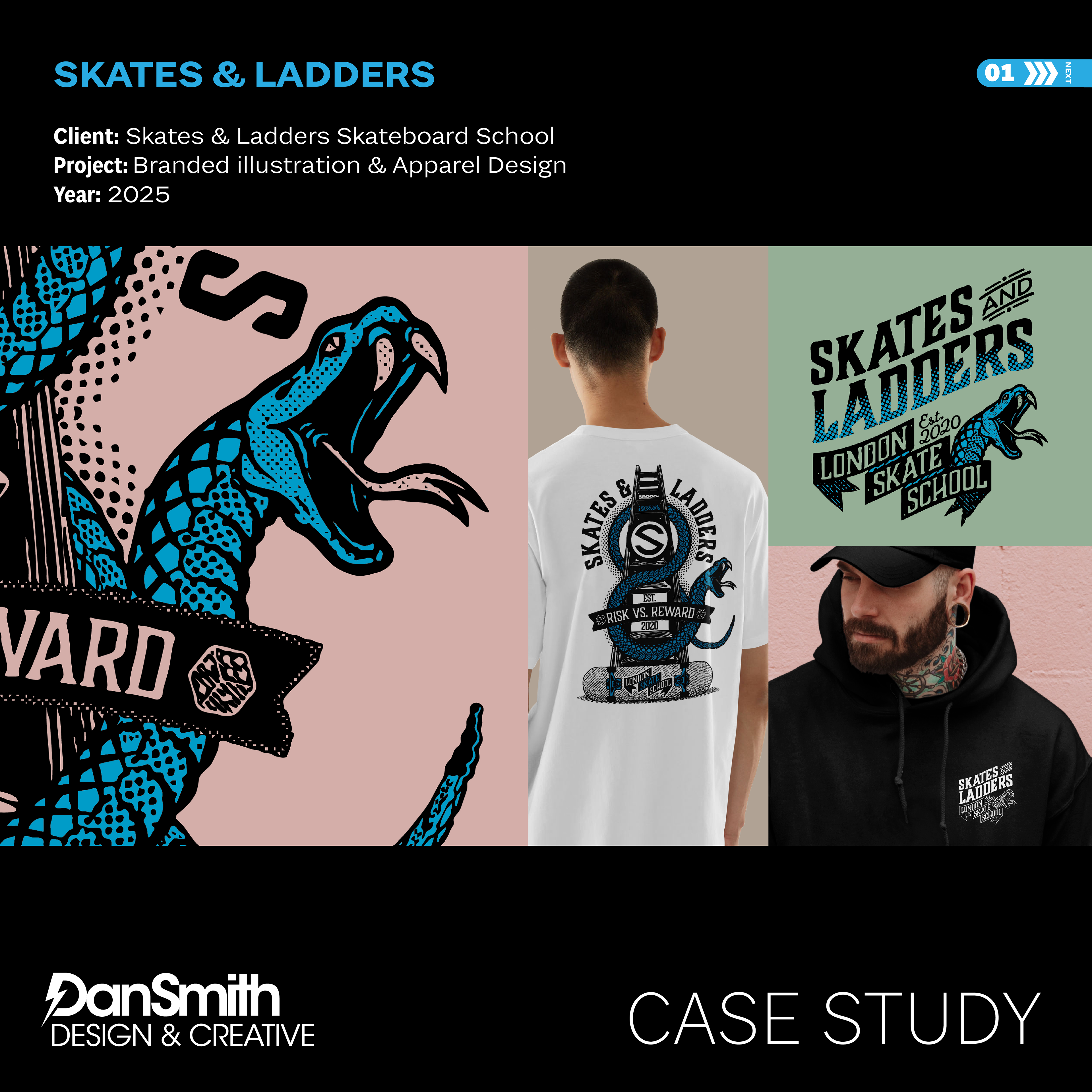
Branded Apparel Graphic System
Overview
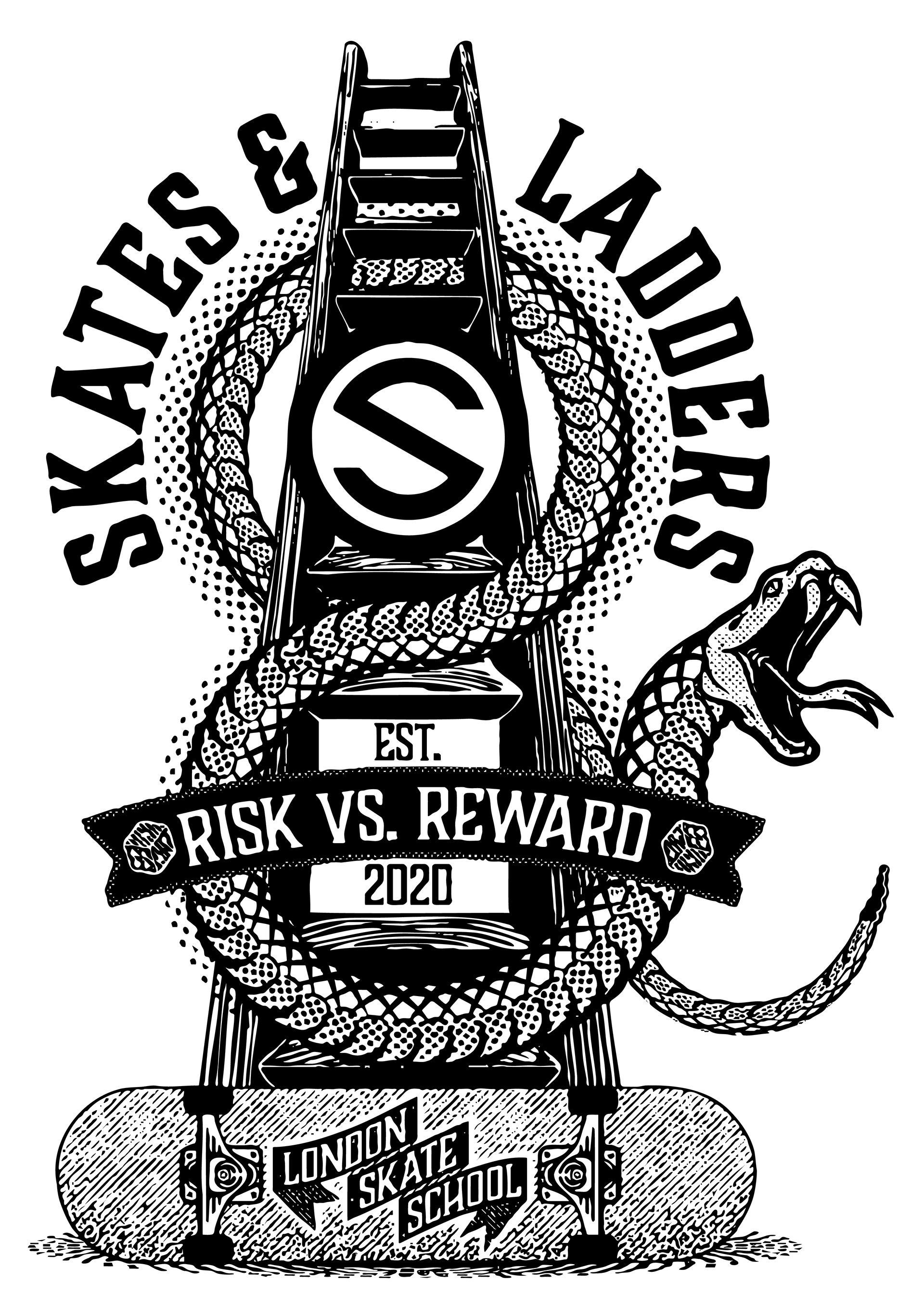
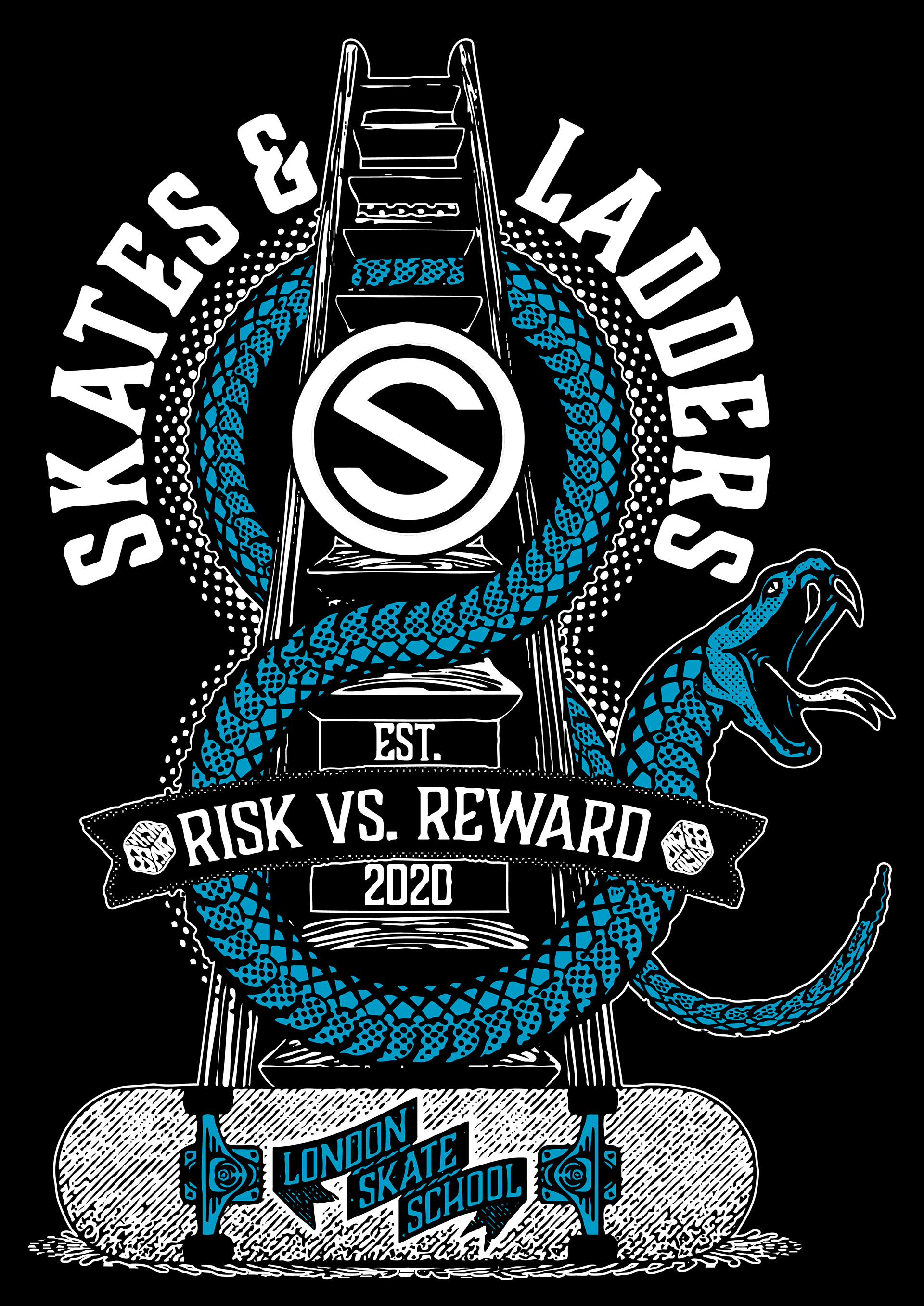
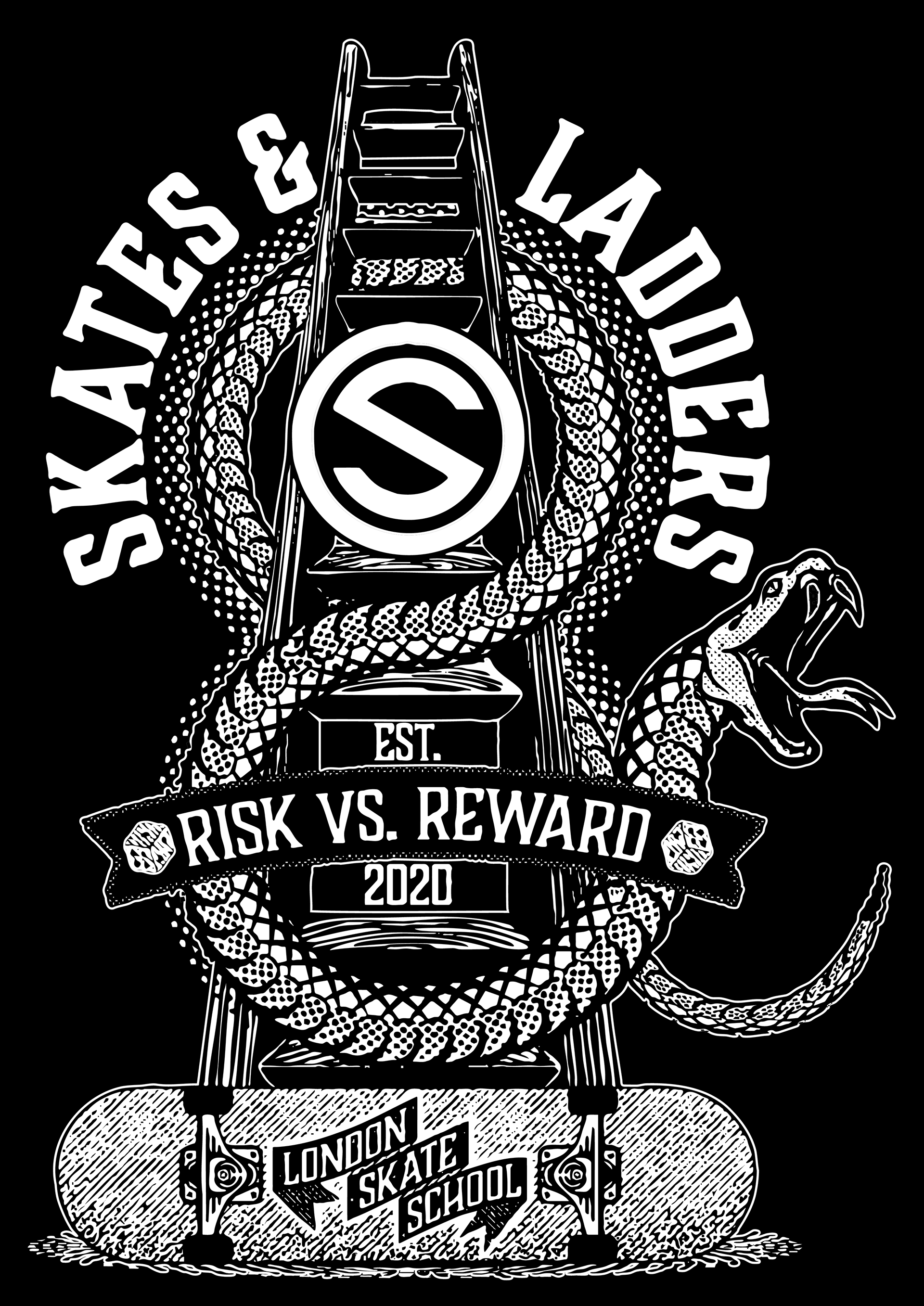
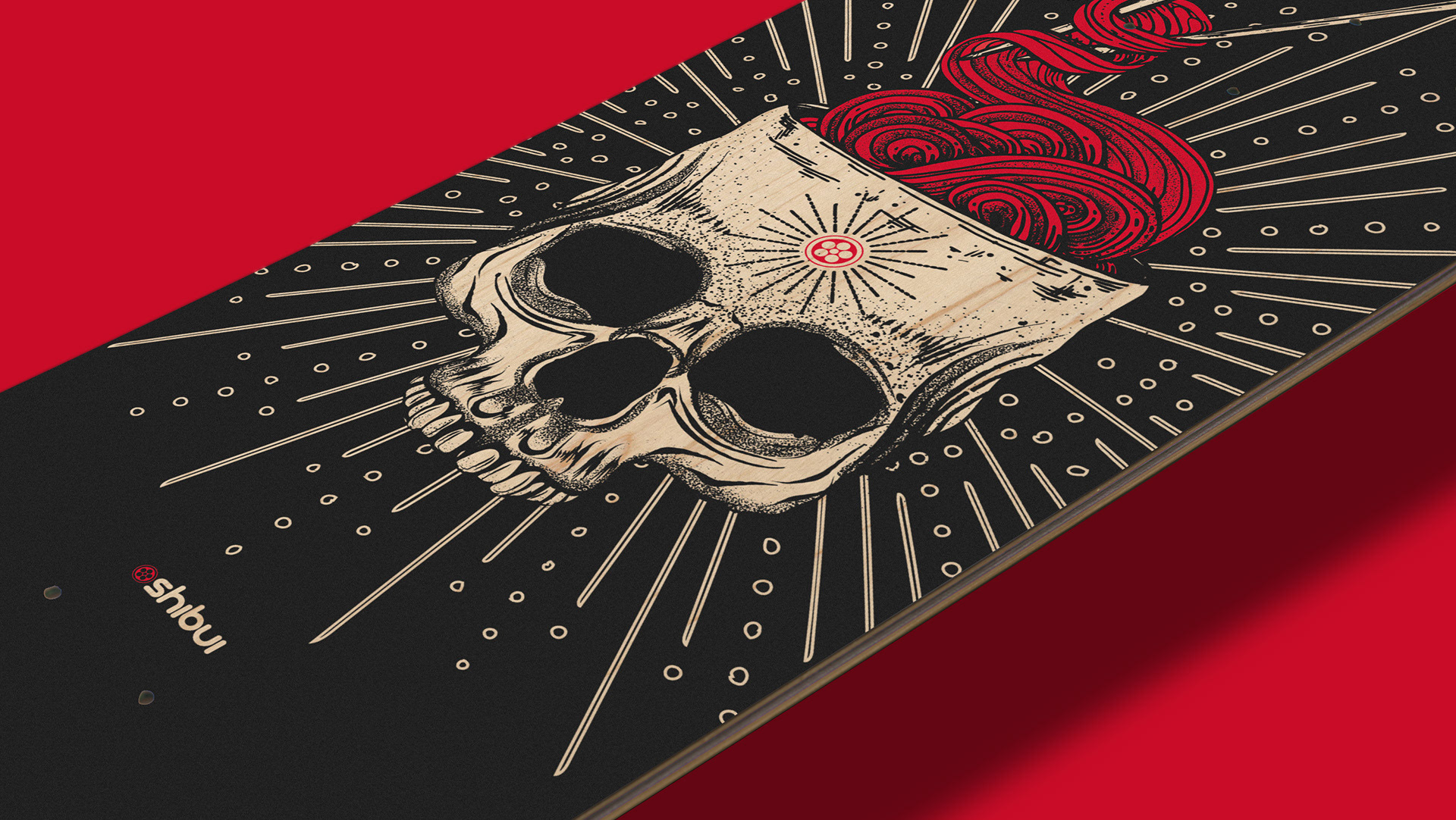
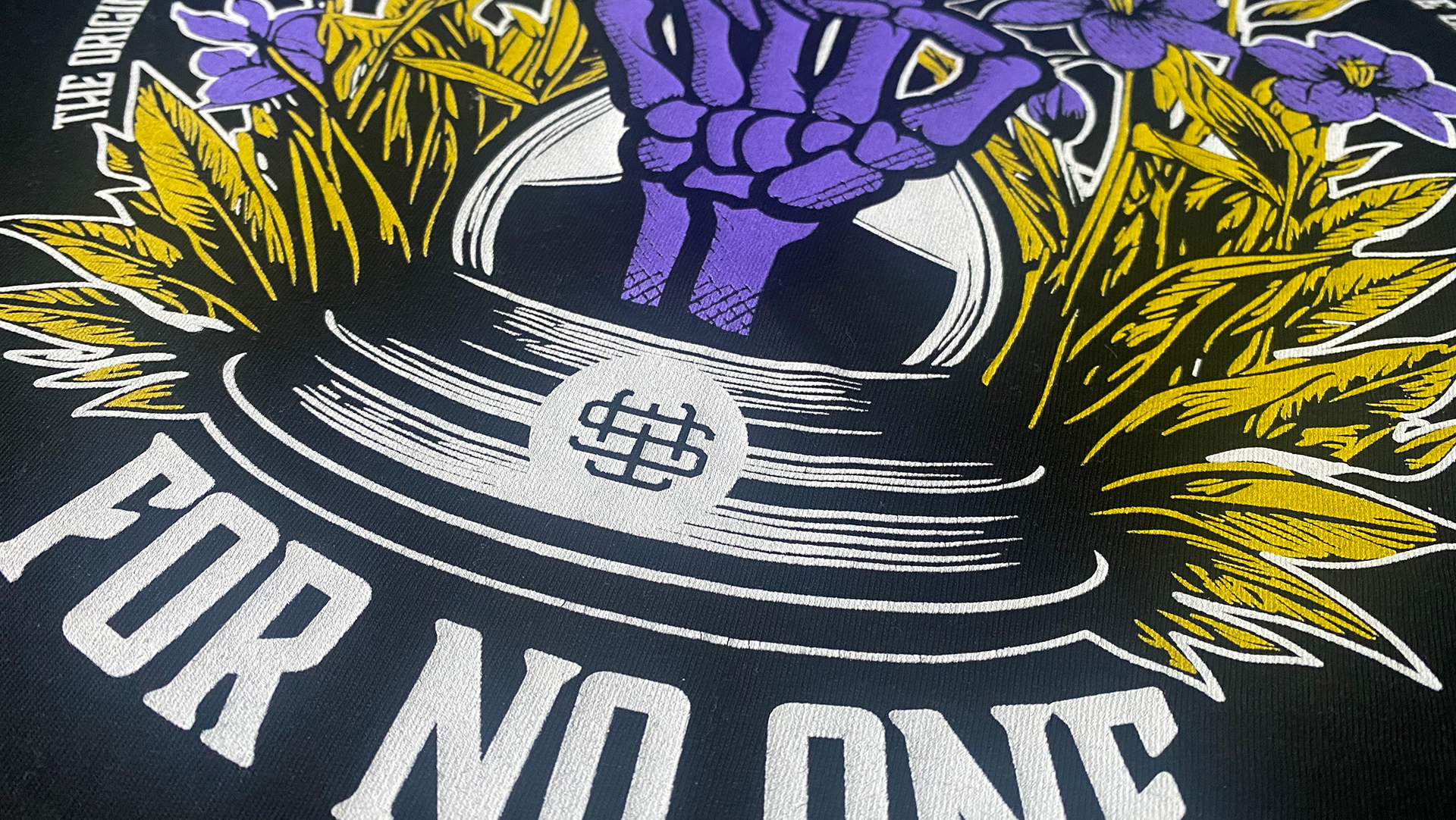
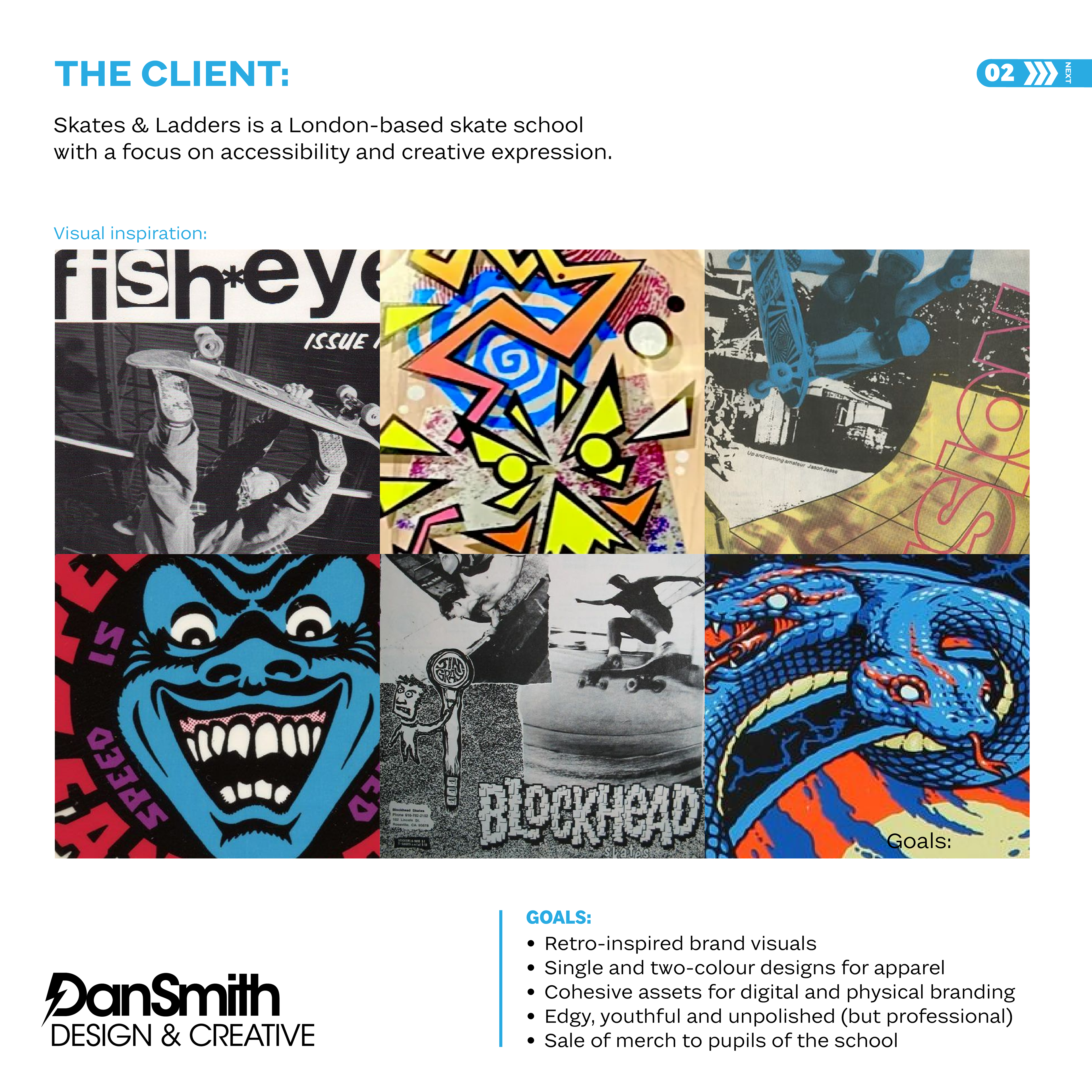
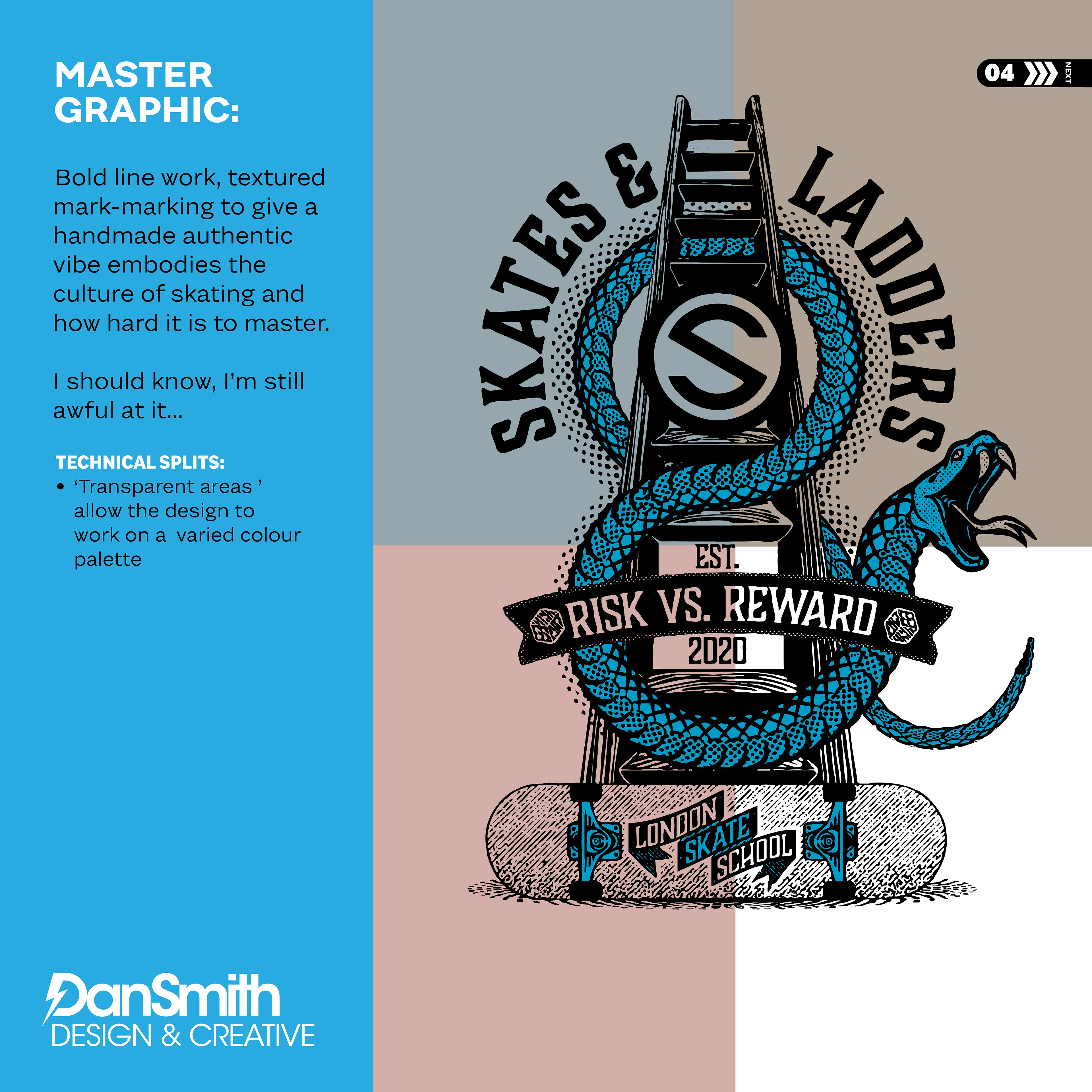
Skates & Ladders required a bold, retro-inspired graphic that captured the spirit of skate progression while remaining commercially viable for apparel production.
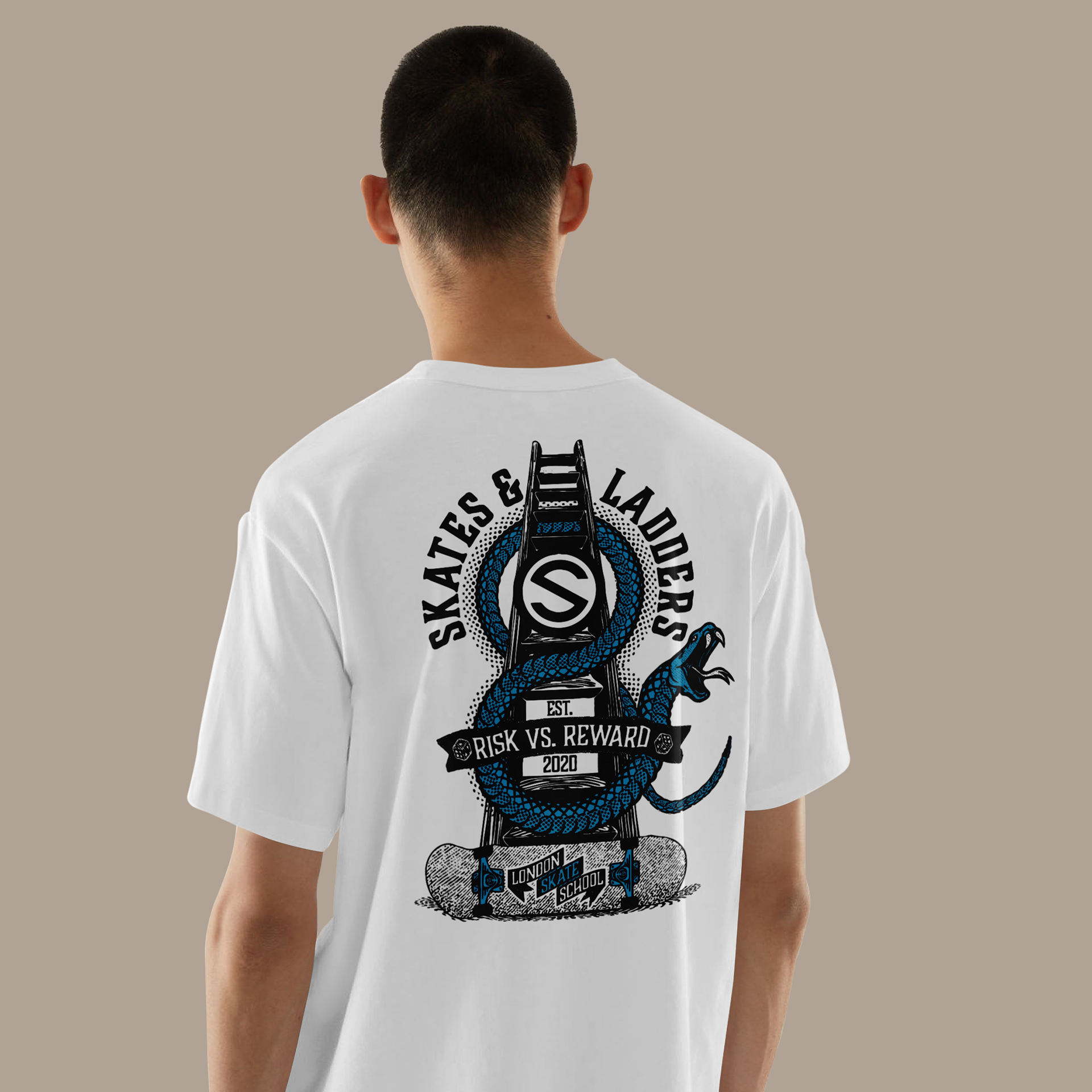
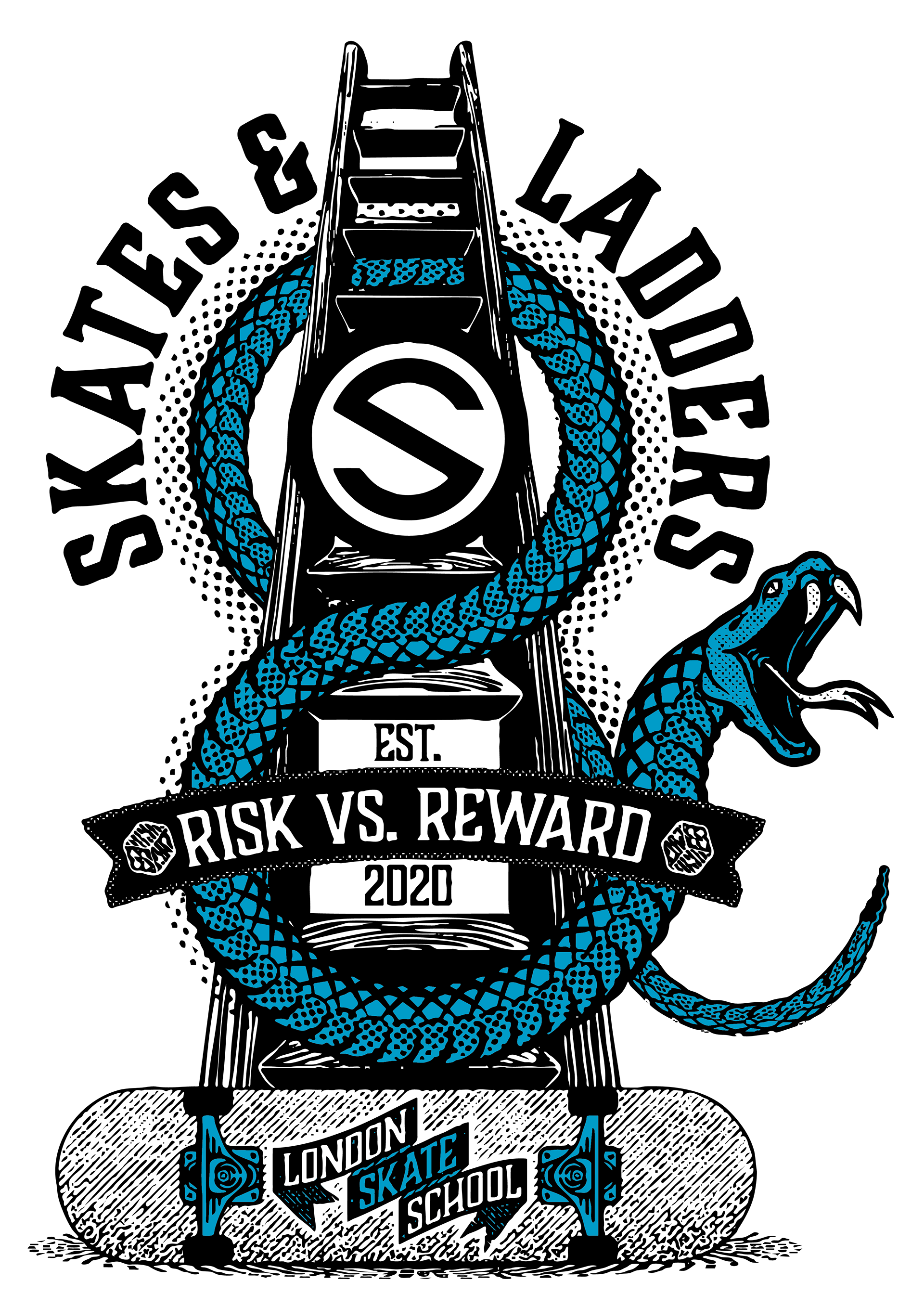
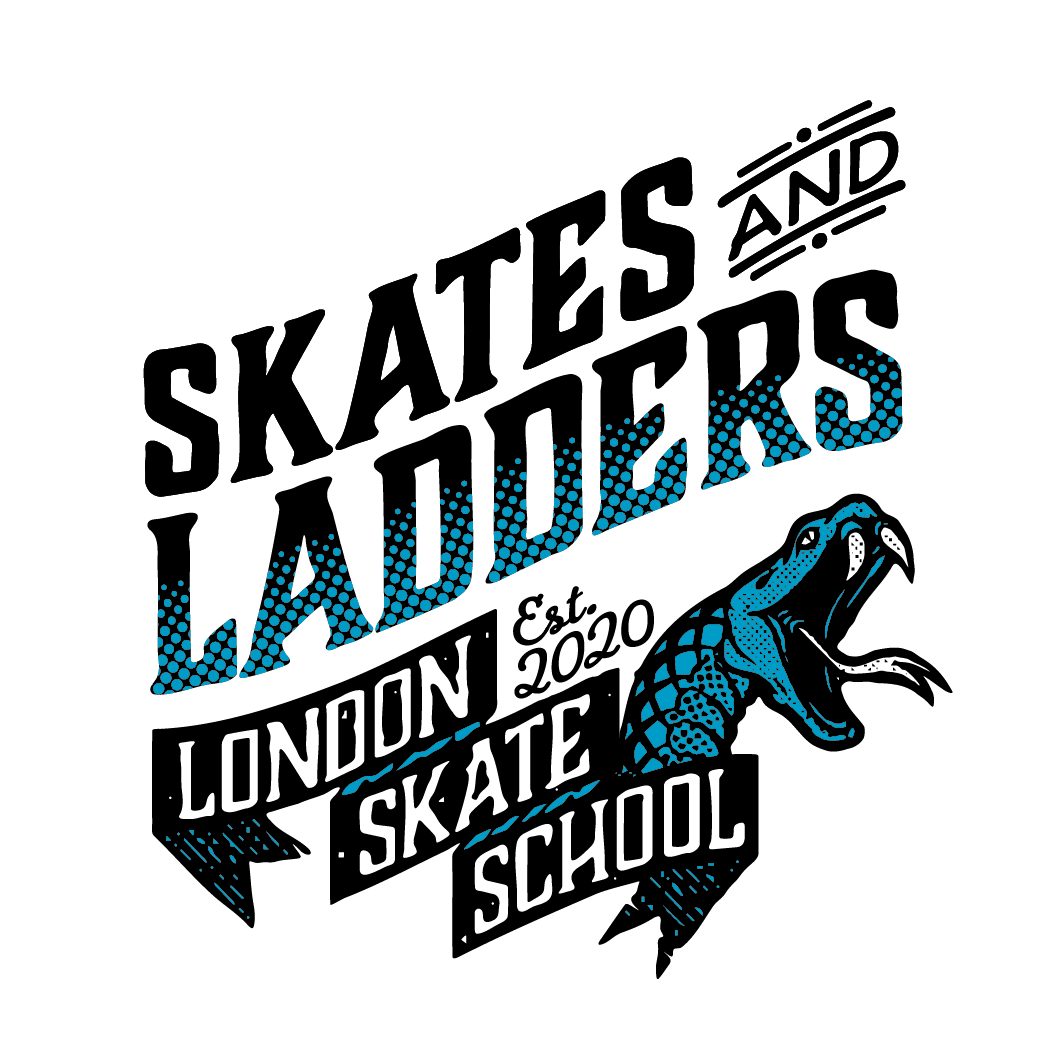
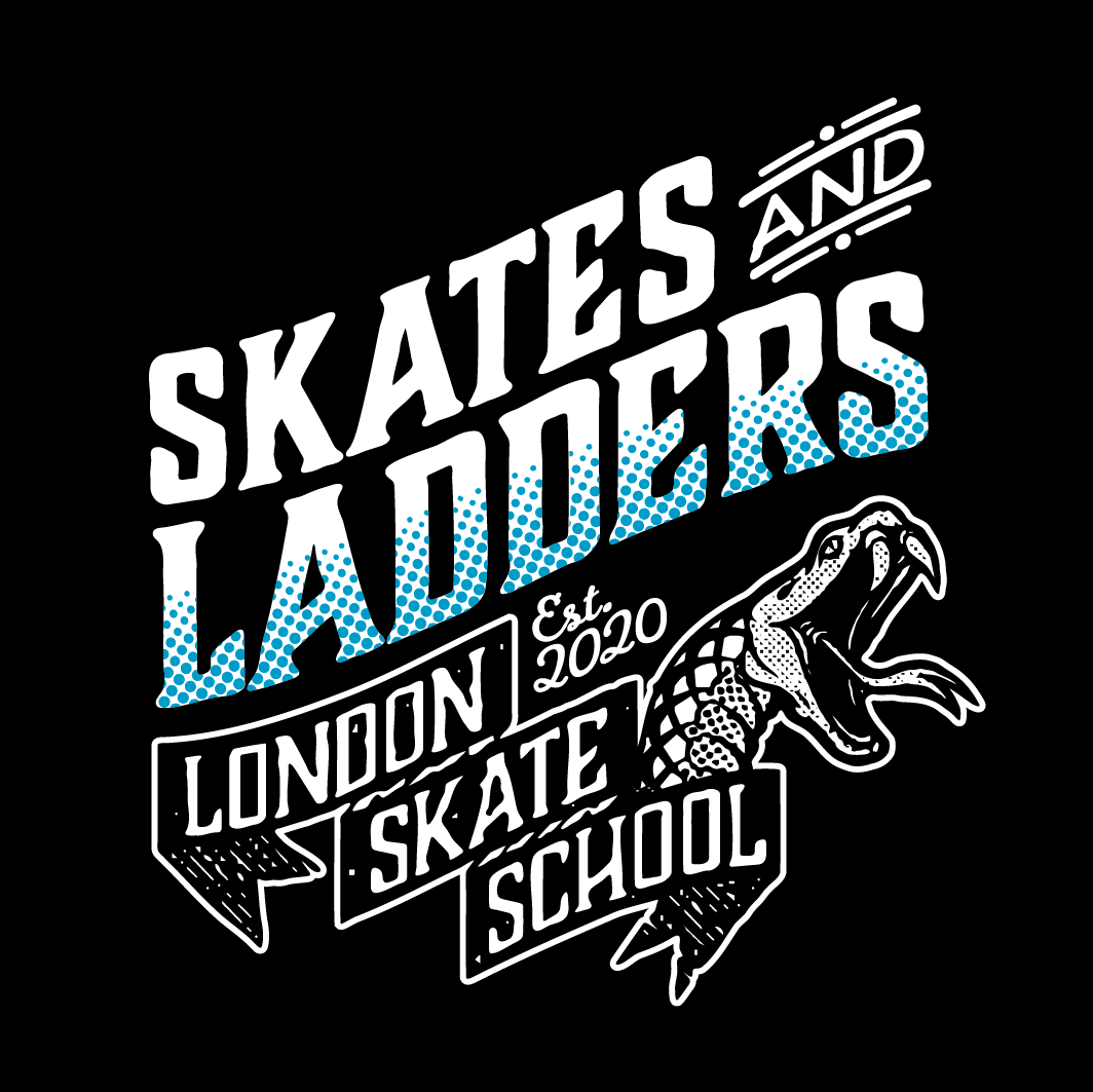
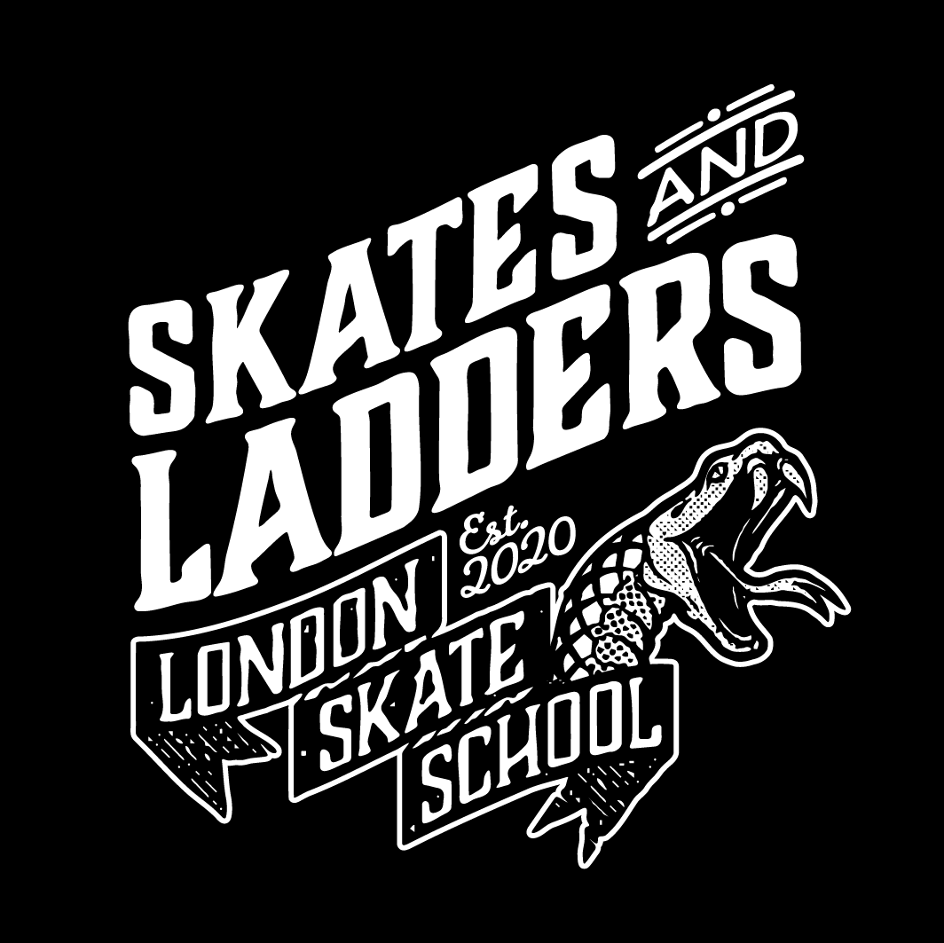
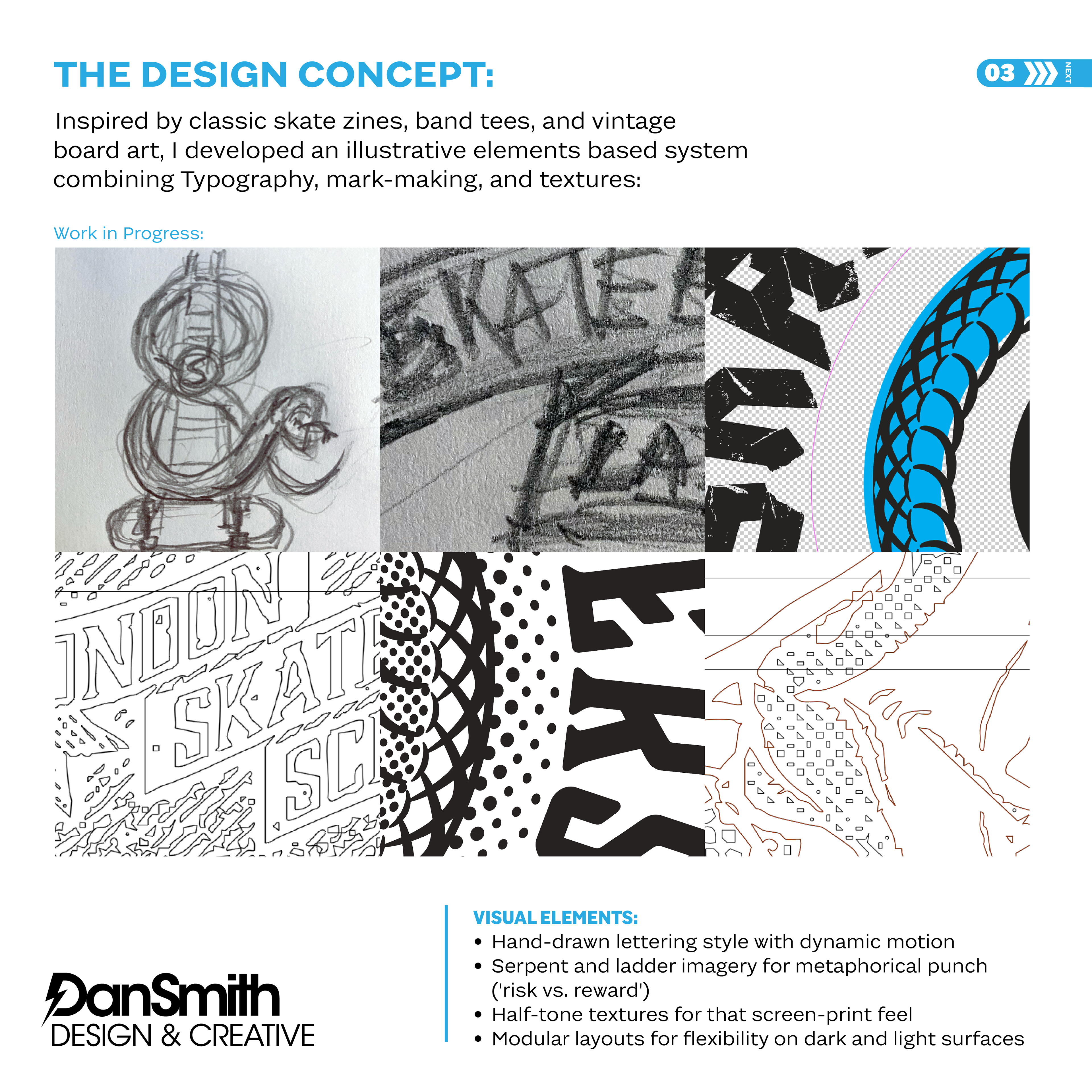
Drawing from classic skate zines and vintage board graphics, I developed a master illustration built around the metaphor of “risk vs. reward.” A coiled serpent, ladder structure, and hand-drawn typography combine with halftone textures and bold line work to create a graphic that feels authentic, energetic, and rooted in skate culture.
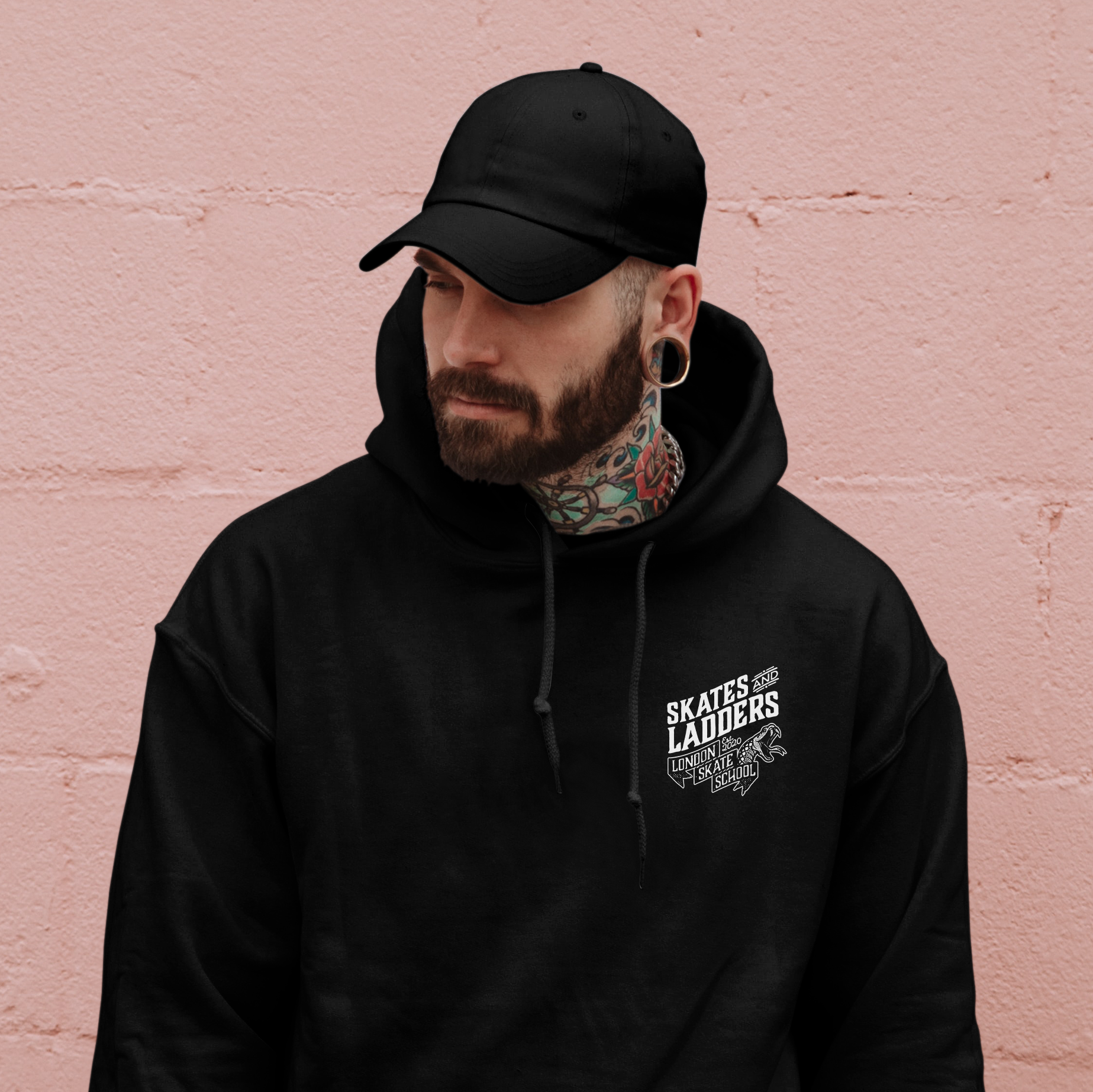
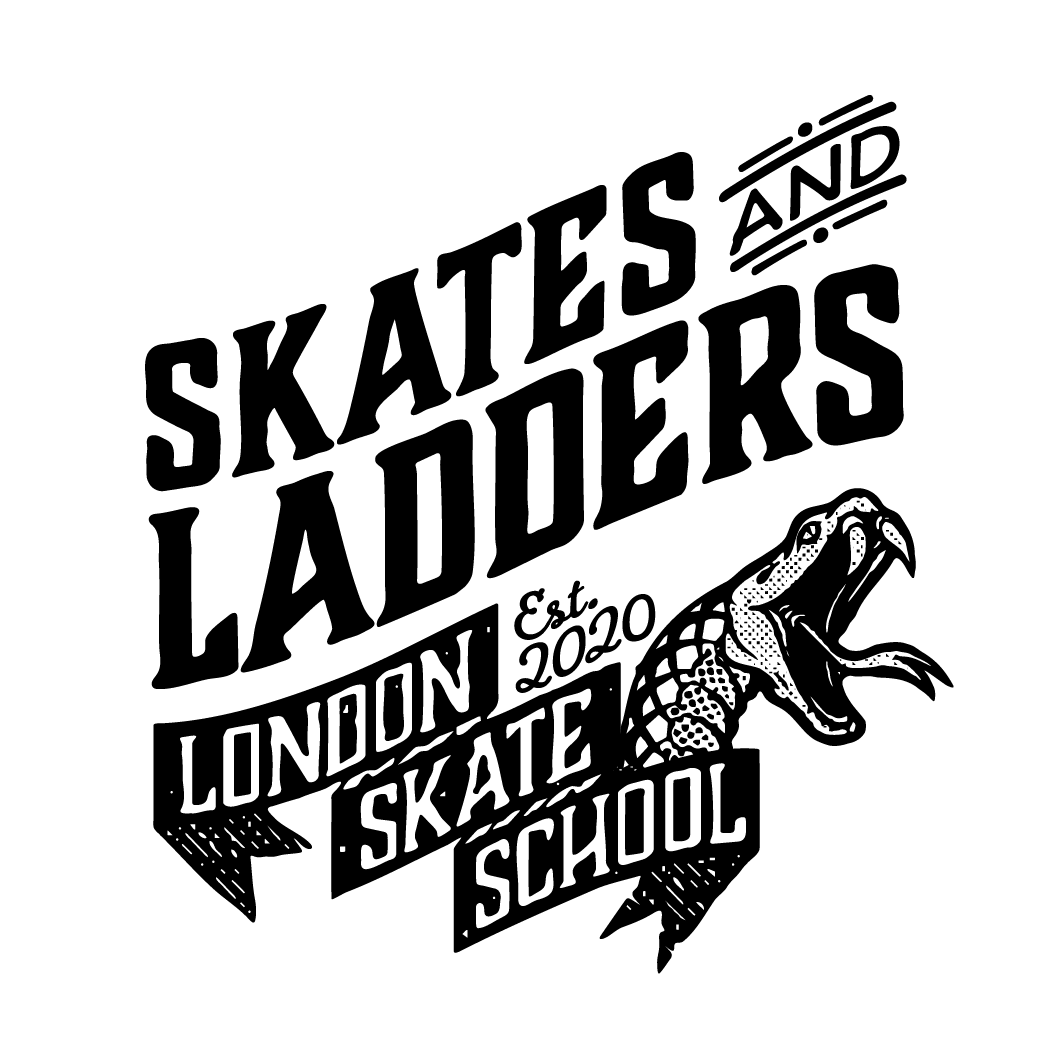
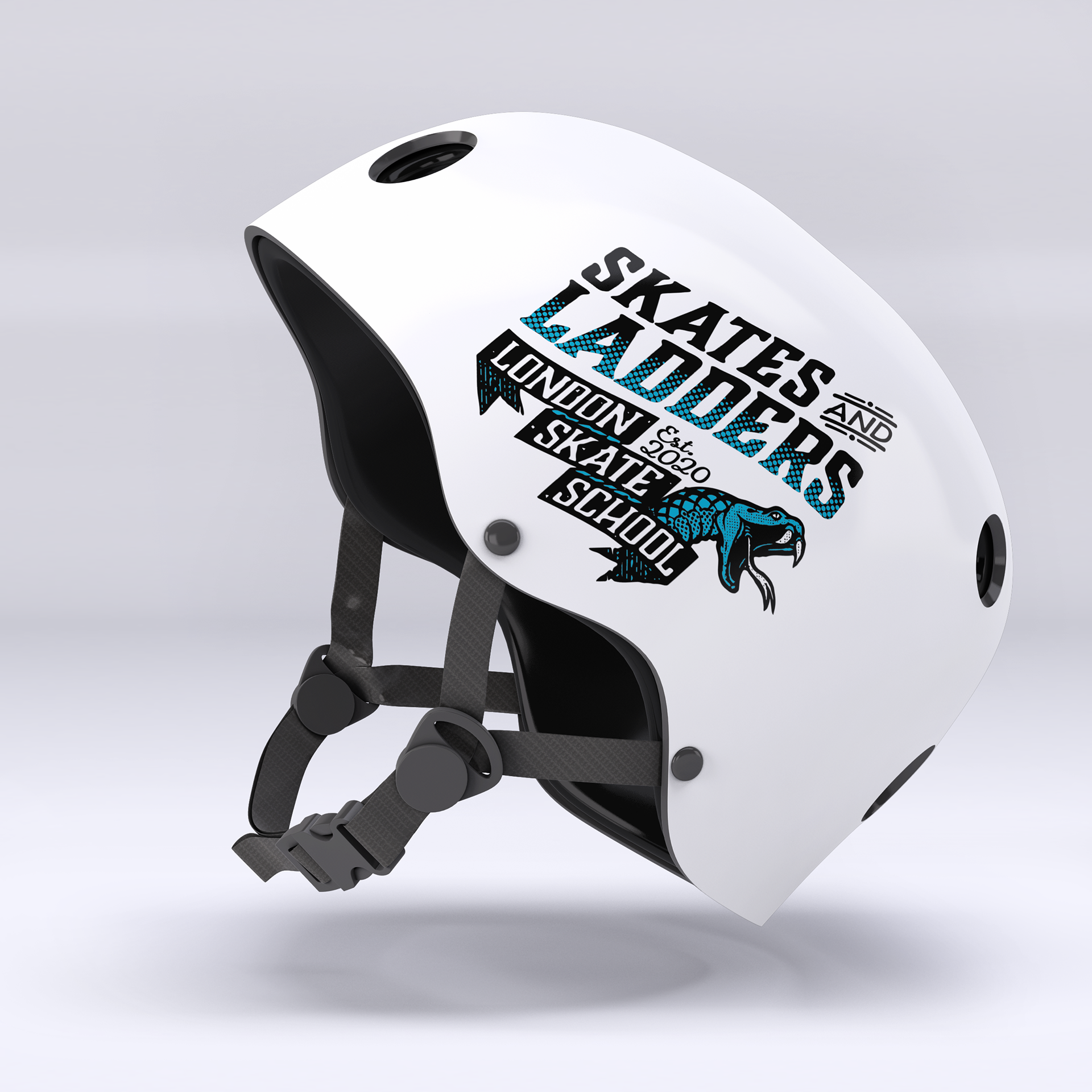
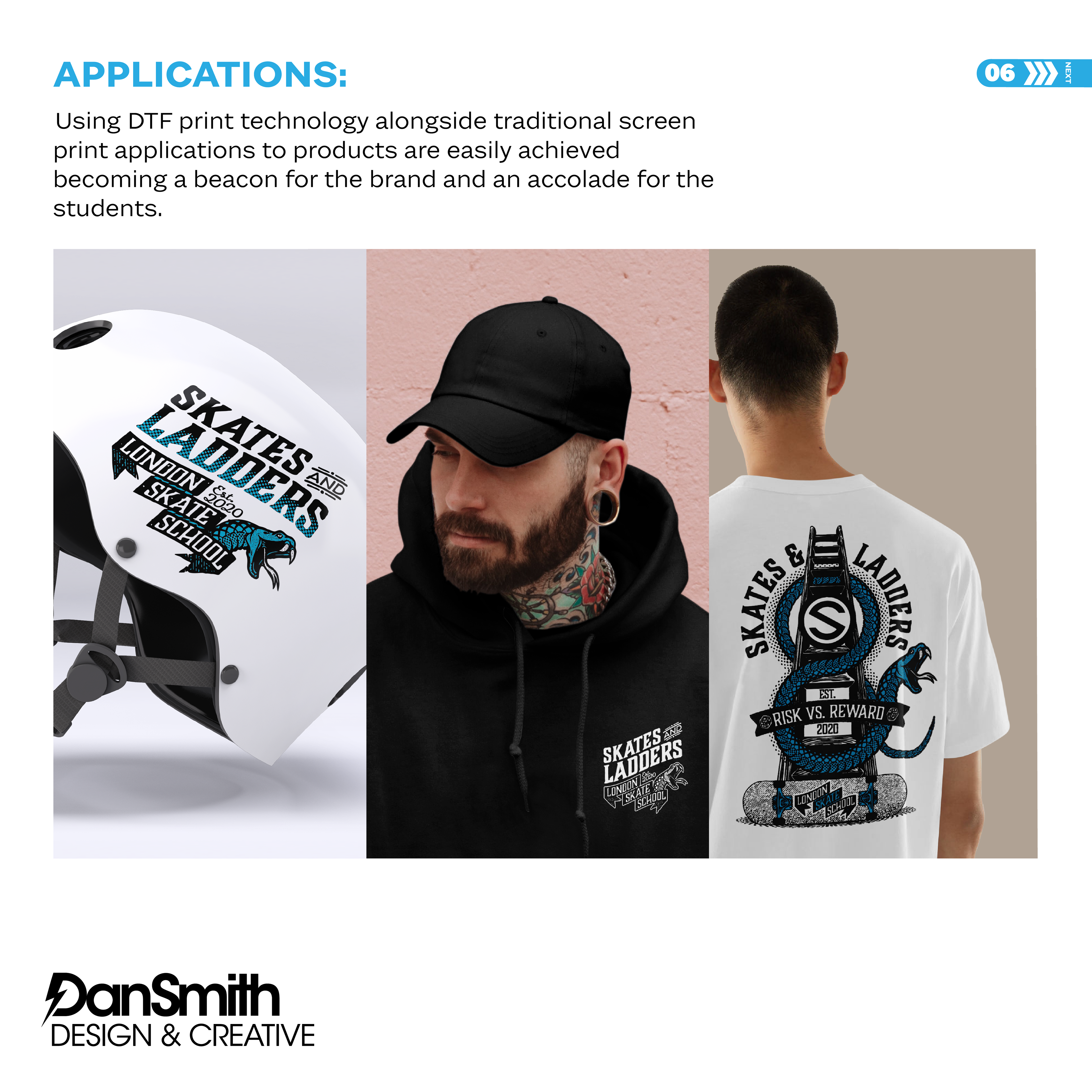
The outcome is a flexible, production-ready system delivered in multiple single and two-colour variations, designed to perform across merchandise, digital platforms, and physical brand touchpoints — reinforcing the school’s identity through a cohesive, culture-led visual language.
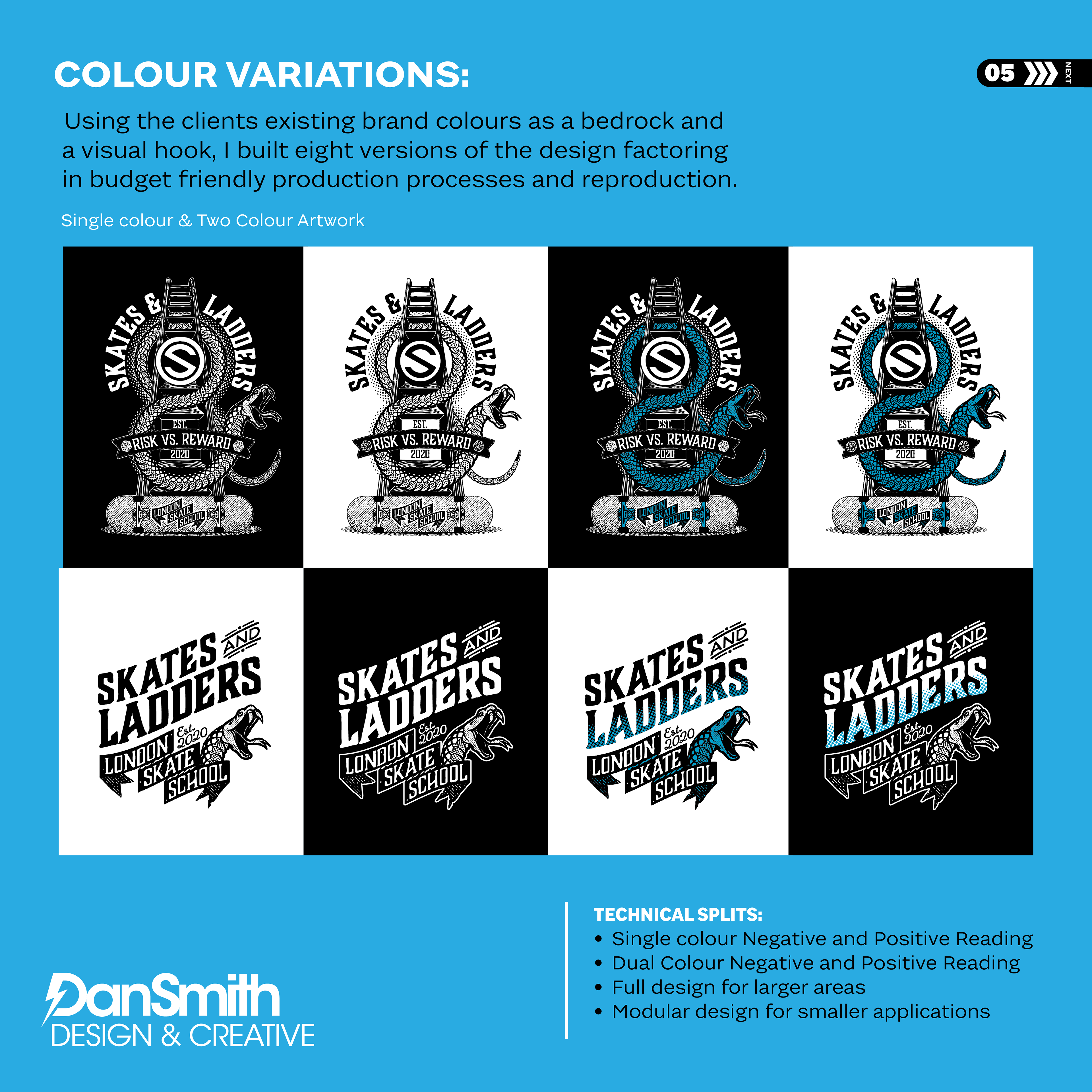
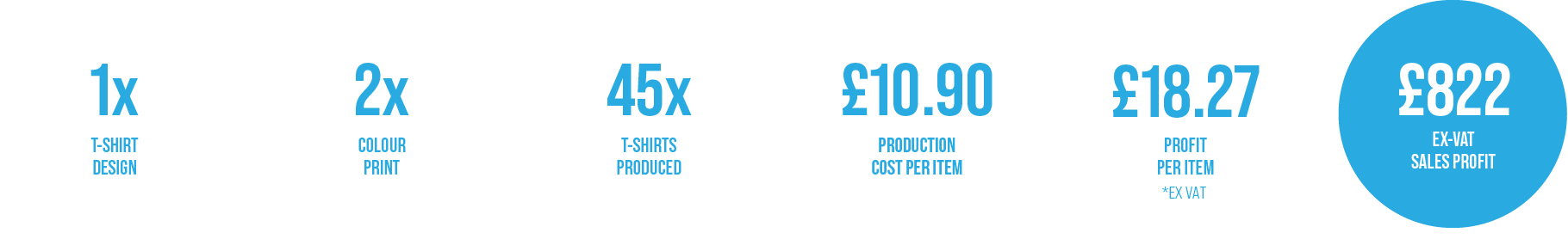
Production Vs. Profit
Design decisions driven by both aesthetics and commercial viability.
Final Designs & Client Feedback
“Dan completely understood what we were trying to achieve from the outset. He captured the spirit of skate culture while delivering something that felt considered, professional and production-ready. The graphic system he created gave us flexibility across apparel and merch without losing impact, and the final result feels authentic to our community. It’s bold, gritty and exactly what we needed — we couldn’t be happier with it.”
Nick Warrey, Founder, Skates & Ladders
Nick Warrey, Founder, Skates & Ladders