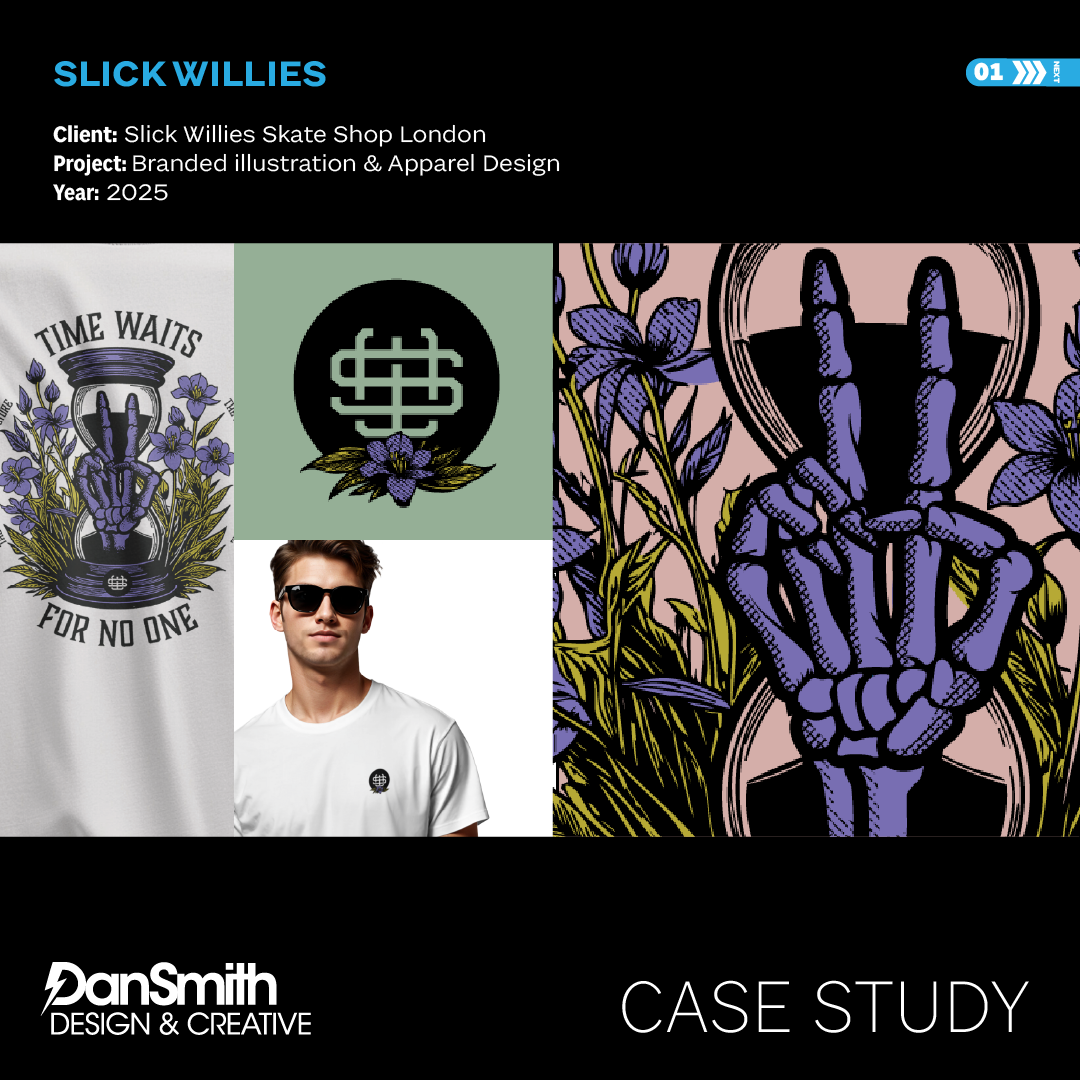
Branded Illustration & Apparel System
Overview
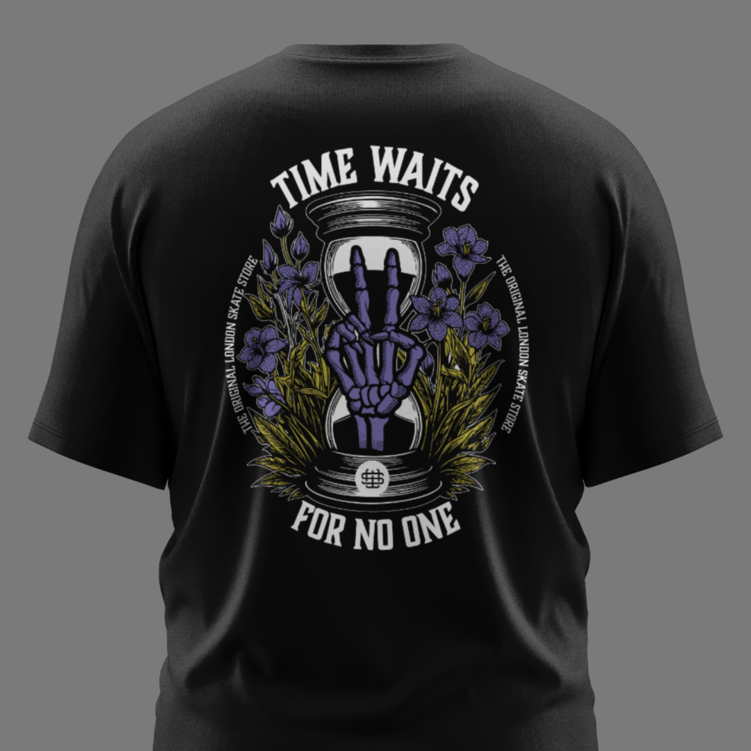
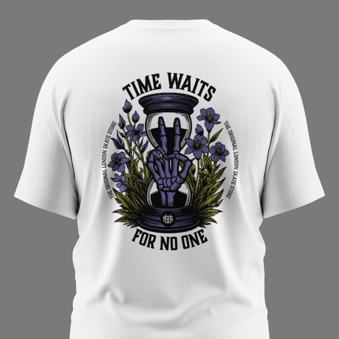
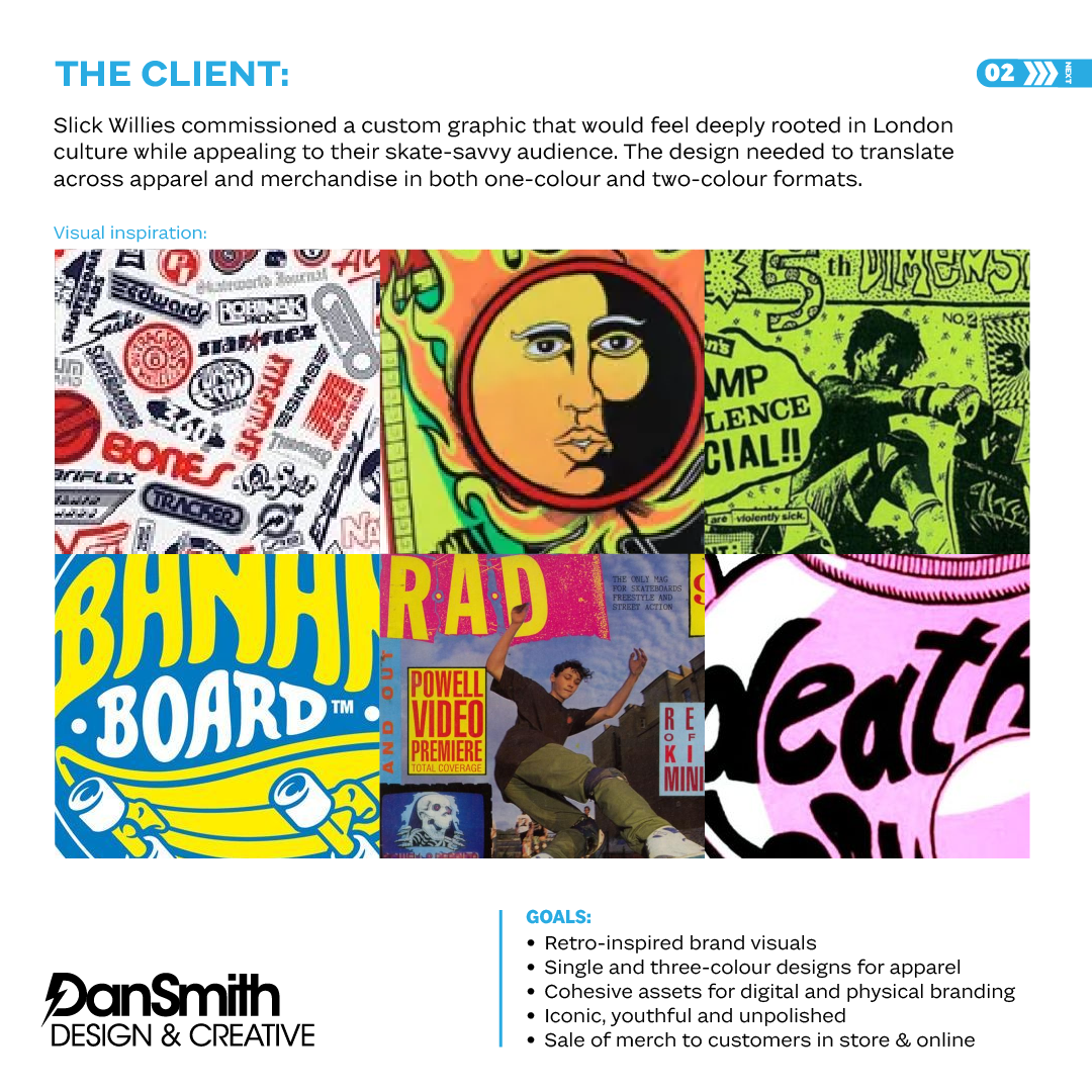
Slick Willies commissioned a London-rooted graphic identity designed to translate seamlessly across apparel and in-store merchandise.
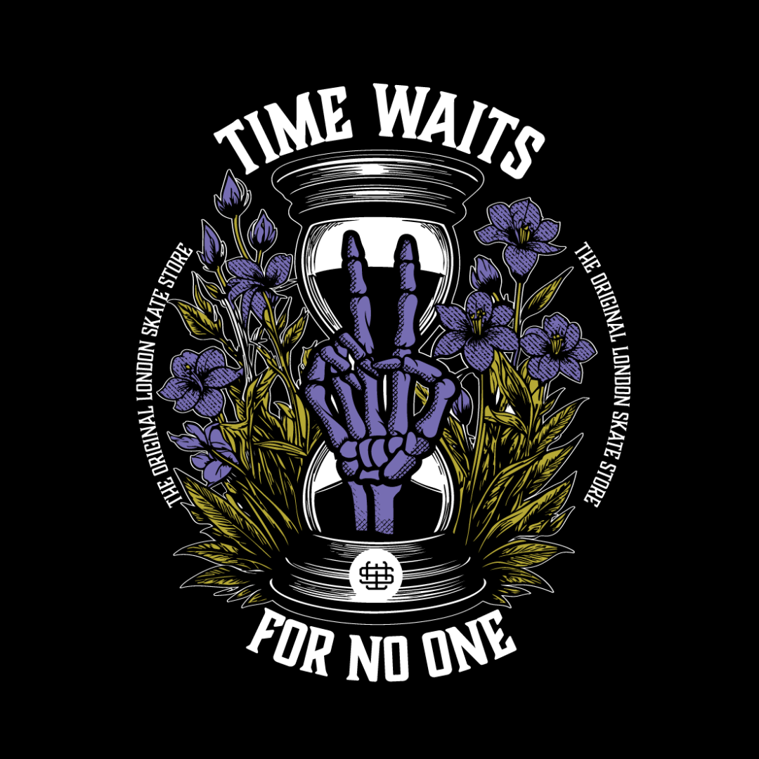
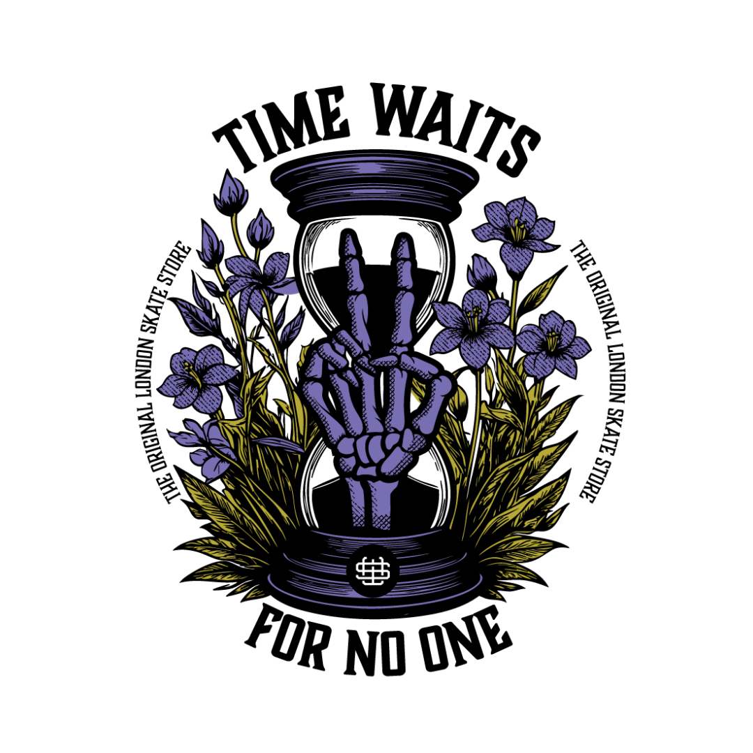
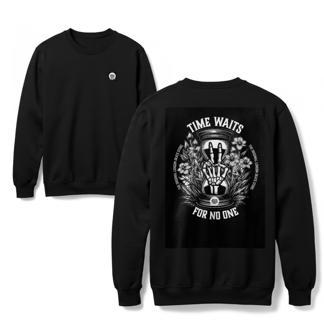
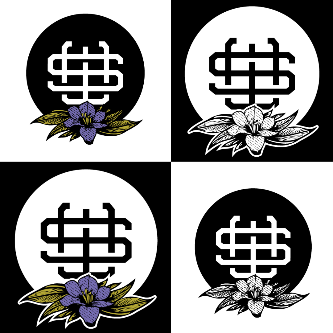
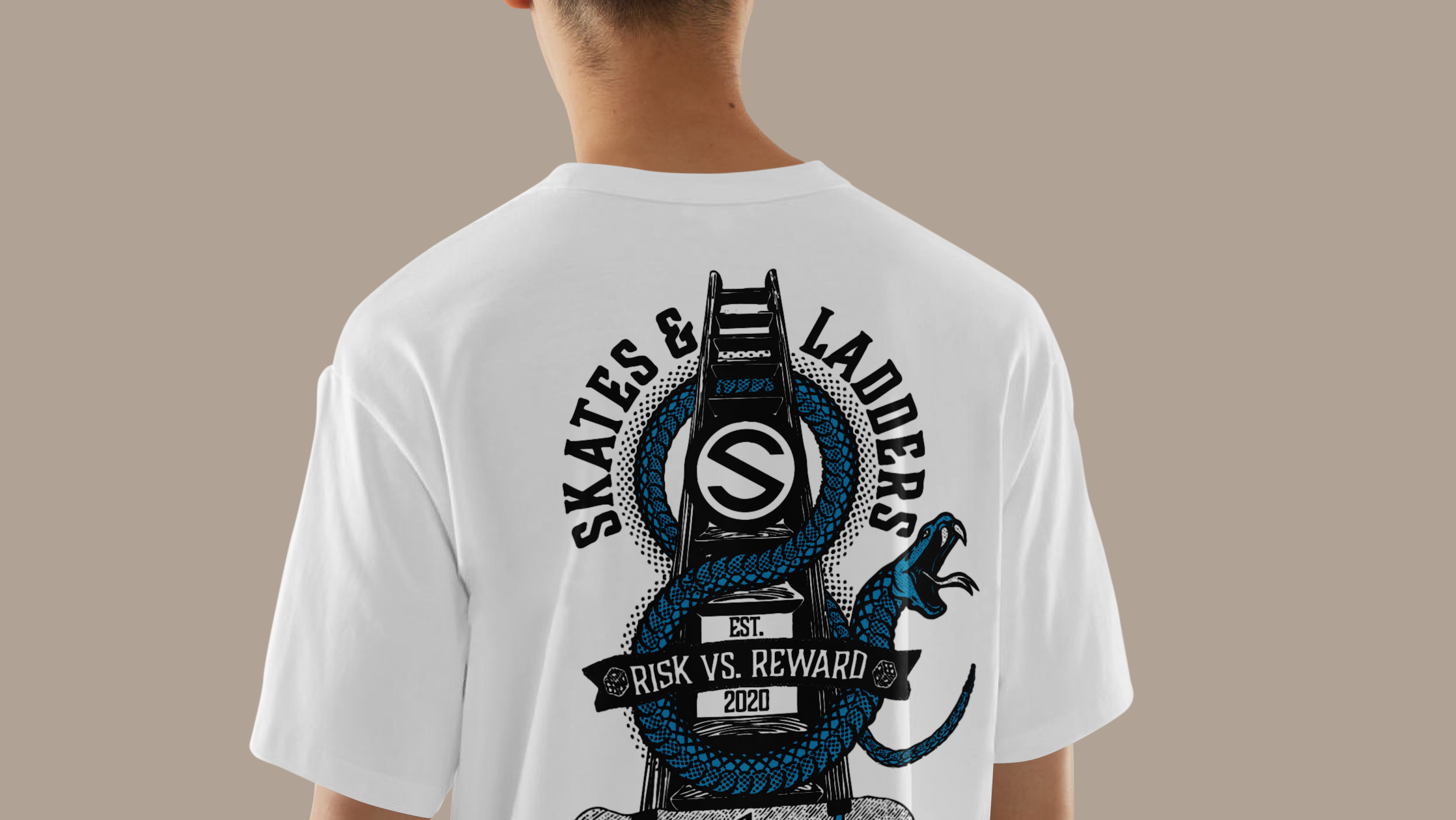
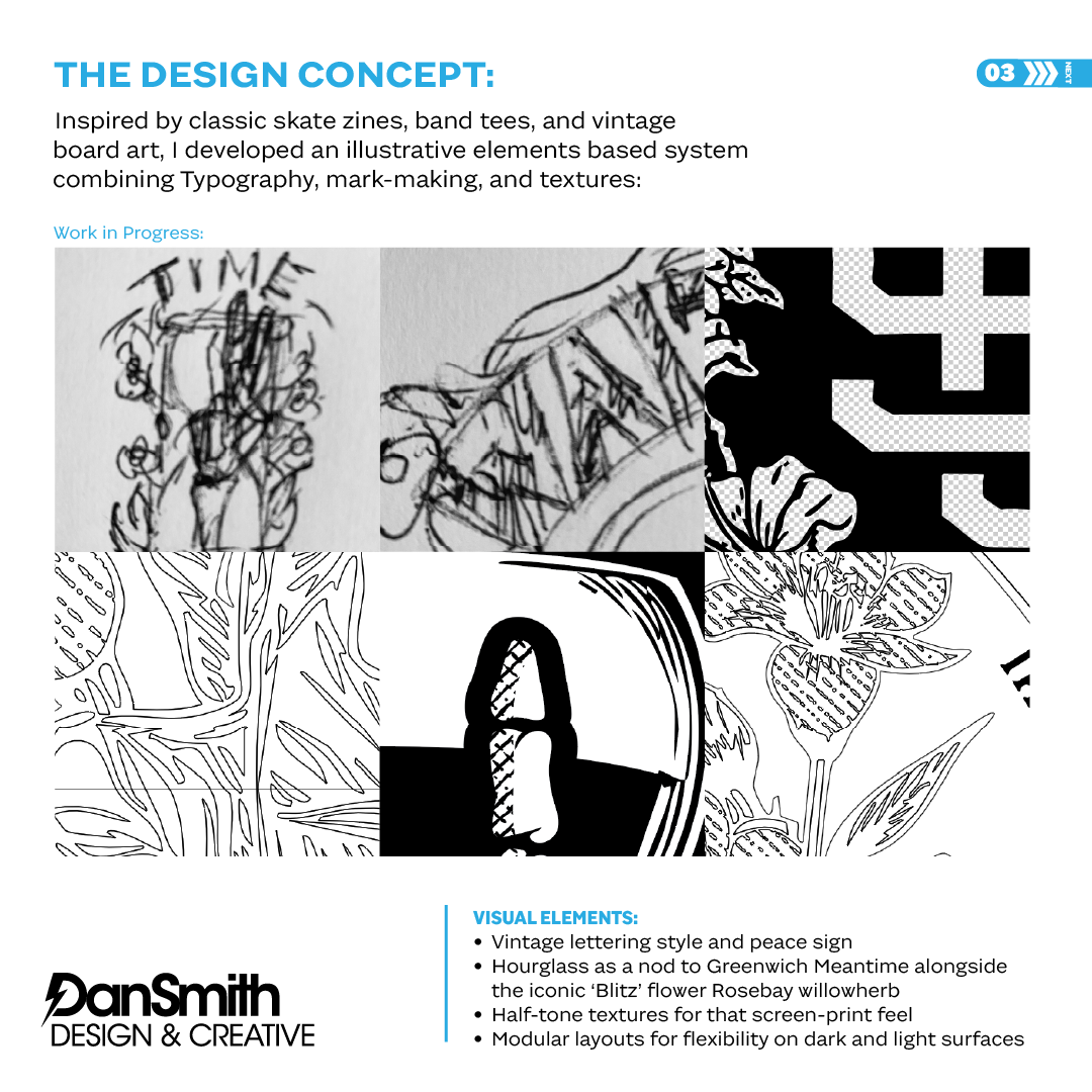
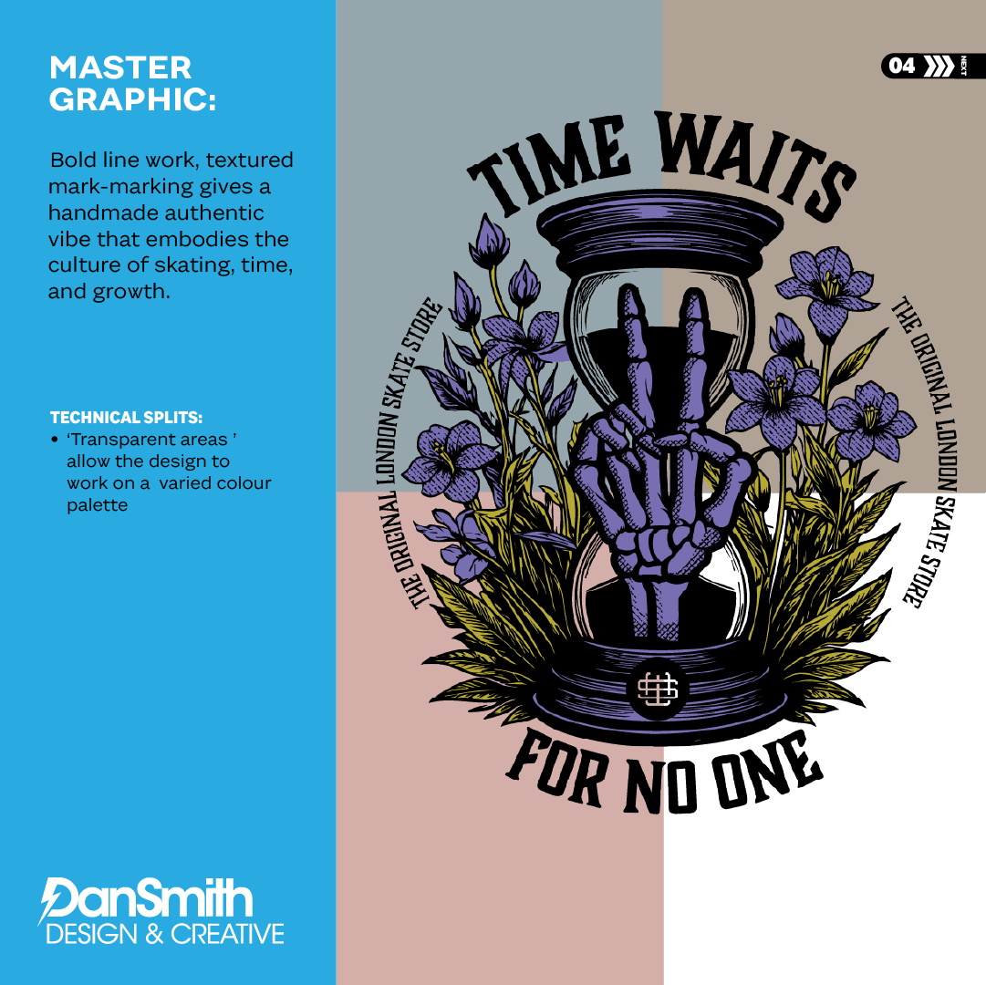
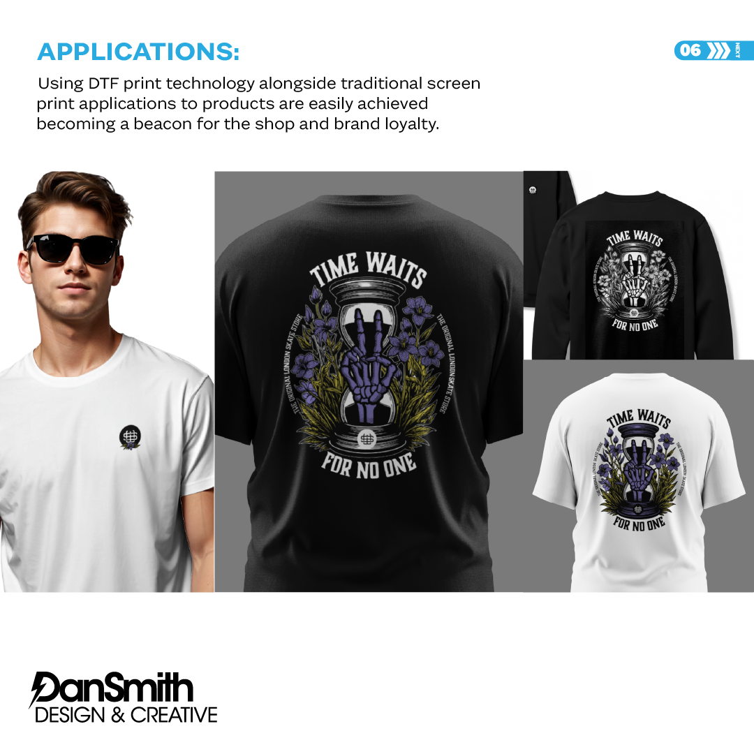
Inspired by vintage skate graphics and underground print culture, I created an illustrative master artwork centred on an hourglass motif — referencing Greenwich Mean Time — paired with the Rosebay willowherb as a subtle nod to London resilience. Vintage lettering, bold line work and textured detailing ensured authenticity while supporting production flexibility.
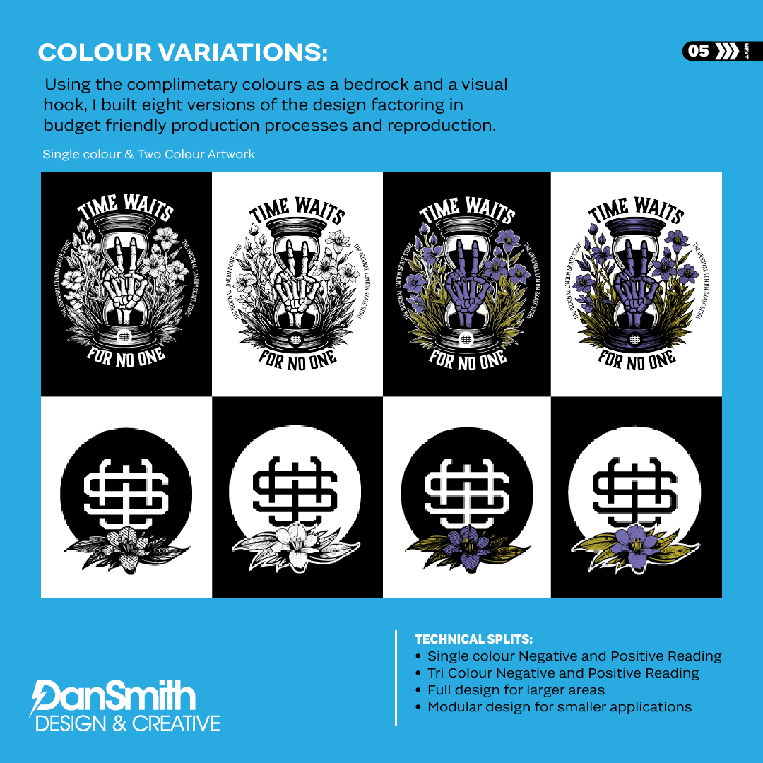
The final outcome is a scalable, production-ready graphic system delivered in single and multi-colour variations — reinforcing the brand’s legacy within London skate culture across both retail and digital environments.
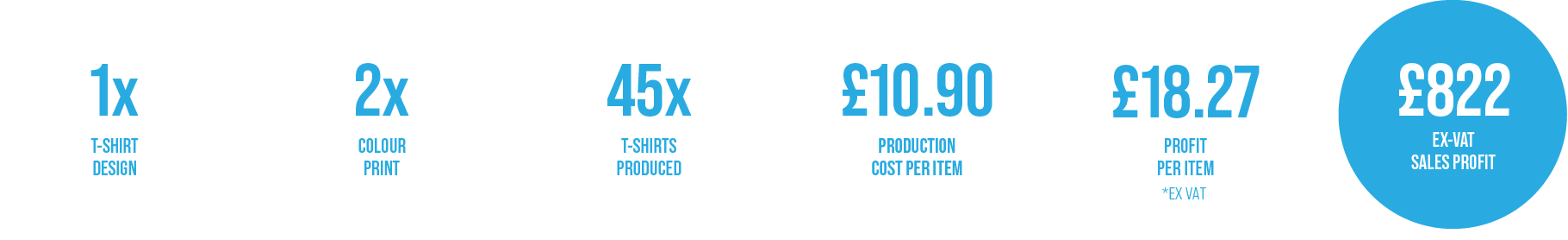
Production Vs. Profit
Production was central to the design process. Each graphic was carefully structured to minimise print complexity and control costs, using efficient colour separations without losing impact. The result is a premium, screen-print-ready finish that protects margins while maintaining authenticity and quality.
Final Designs & Client Feedback
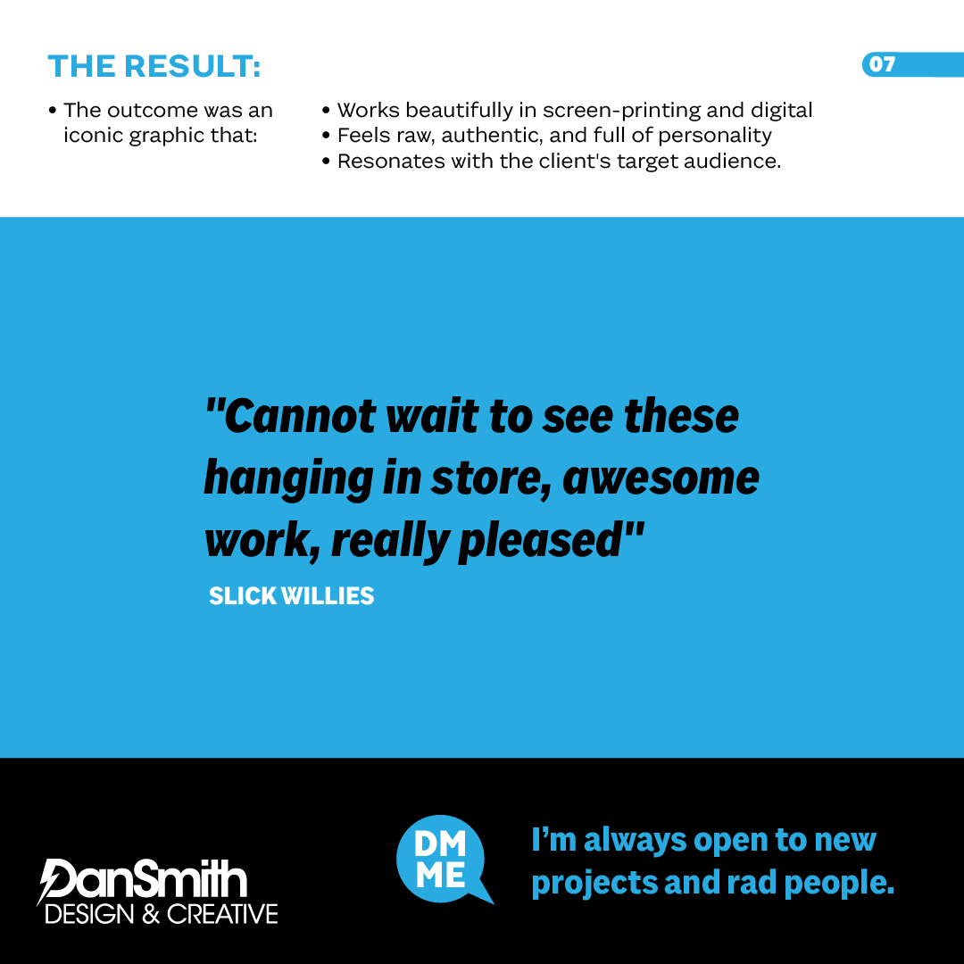
" Obviously no business wants to spend on creative services that won't be profitable, the T-Shirts Dan designed and illustrated for us just flew off the rack, so much so we are getting a second run printed and stickers produced as I write this..."
Nick Wary.
Store Manager
Nick Wary.
Store Manager