Overview
Smith & Muller Paddleboards required a distinctive visual identity that would stand apart within the growing paddleboard market. The project focused on creating a brand that captured the freedom and movement of open water while remaining clear and recognisable across product, marketing and digital touchpoints.
The resulting identity combines a bold graphic marque with flowing design elements inspired by wave motion, creating a visual language that connects the brand directly to its coastal roots.
Logo System
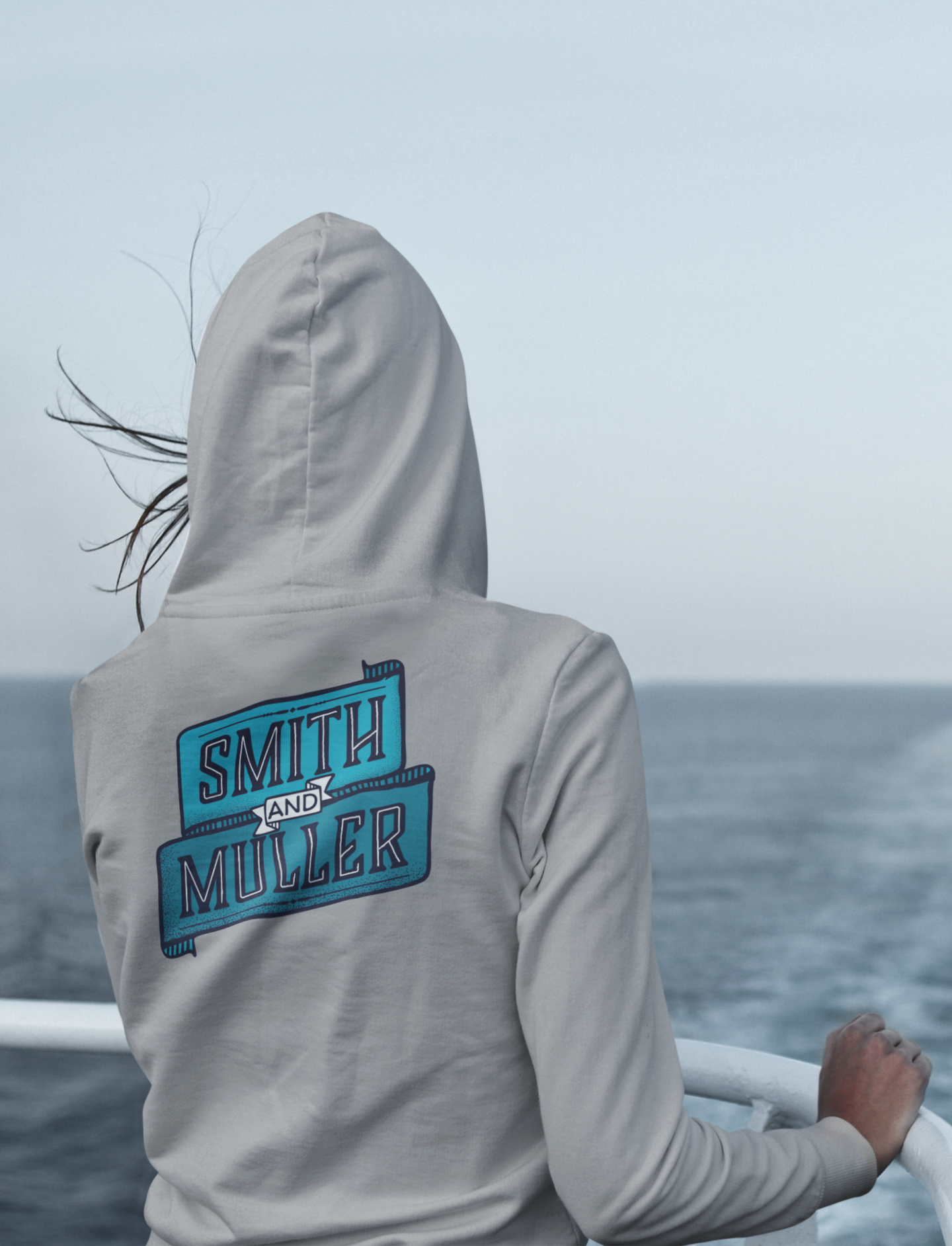
The logo was designed as a flexible identity that works across both brand communications and product applications. Multiple variations allow the mark to adapt across board graphics, digital platforms and promotional materials while maintaining strong brand recognition.
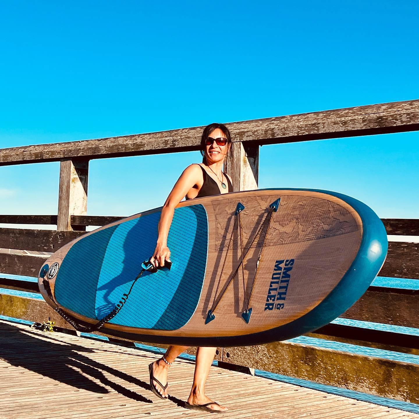
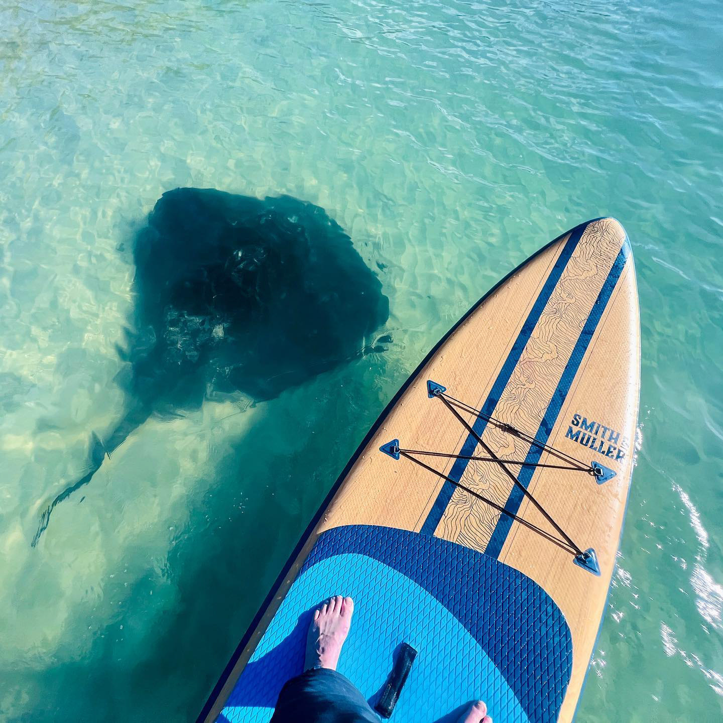
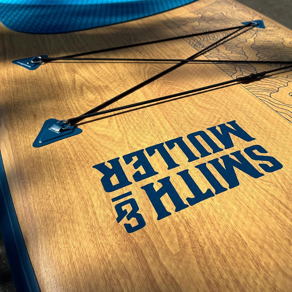
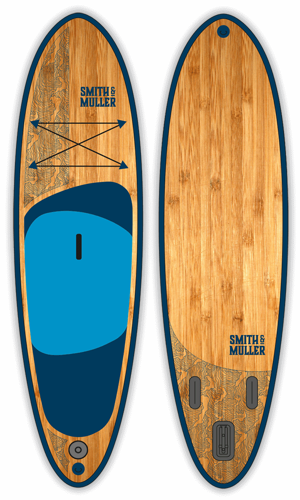
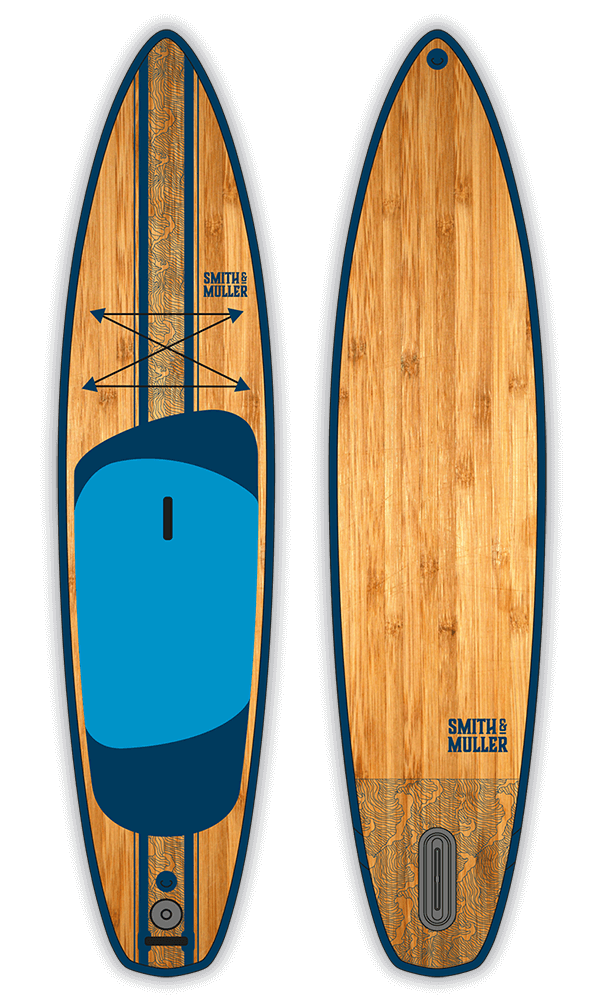
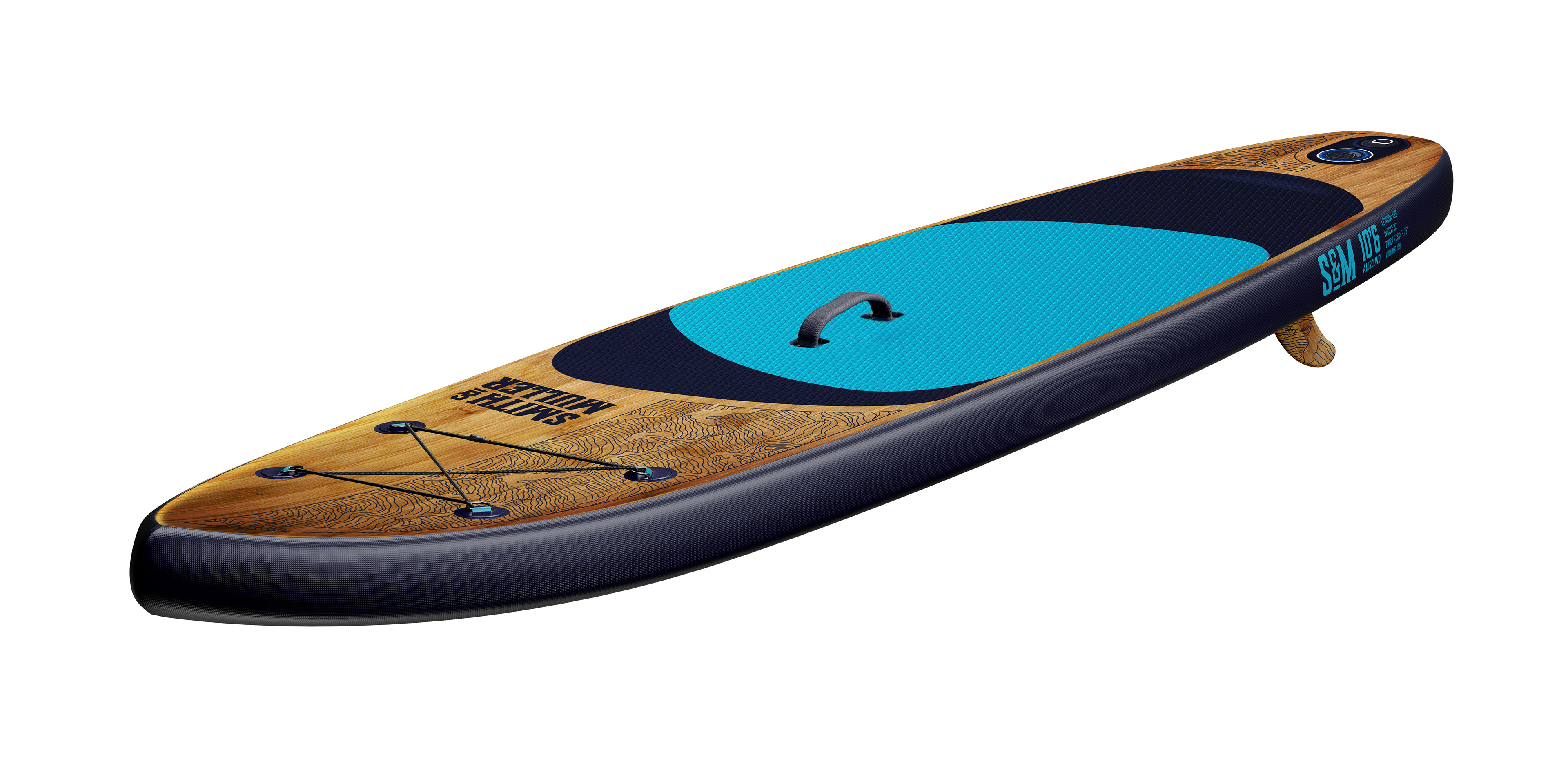
Board Graphics
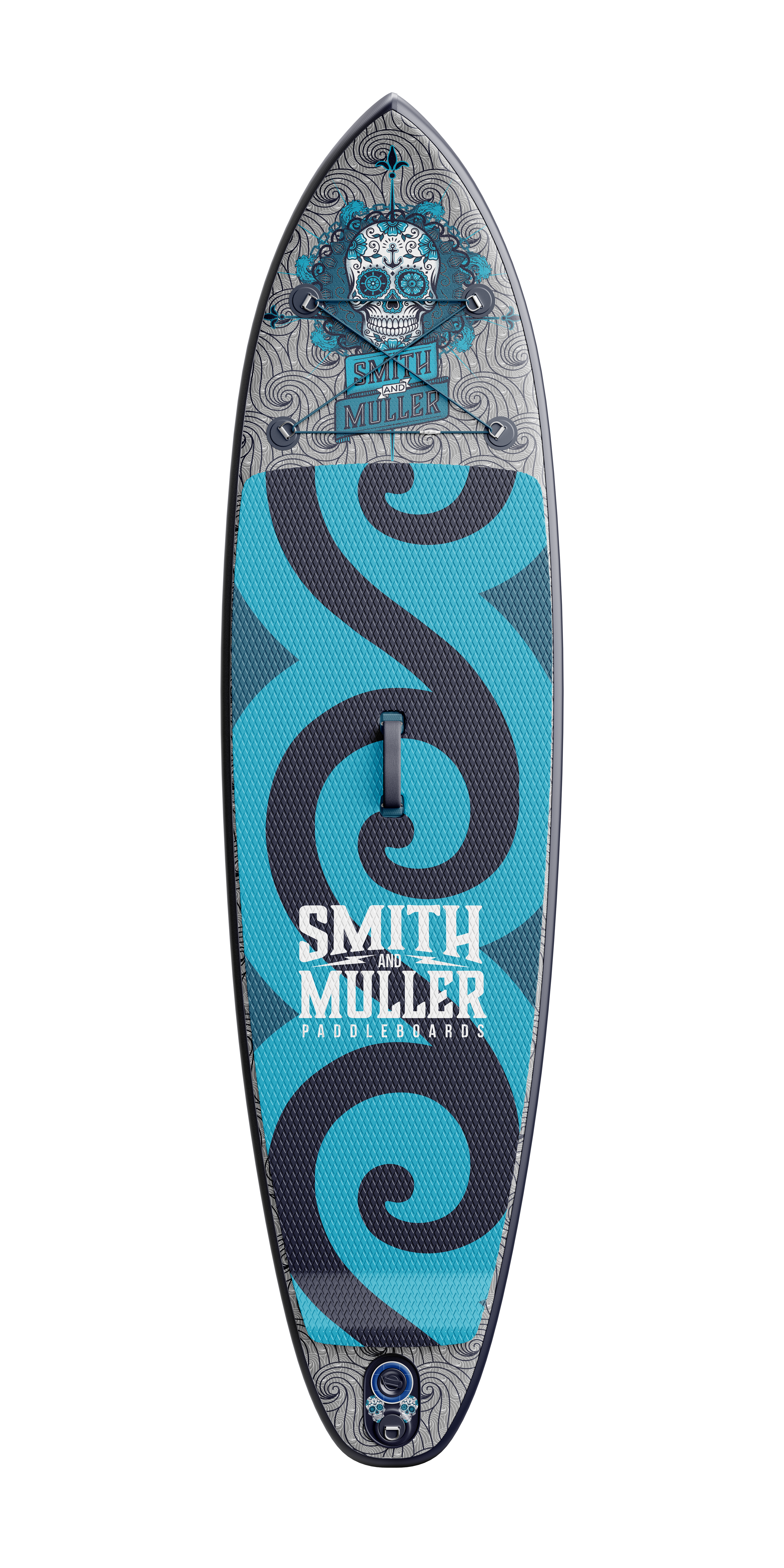
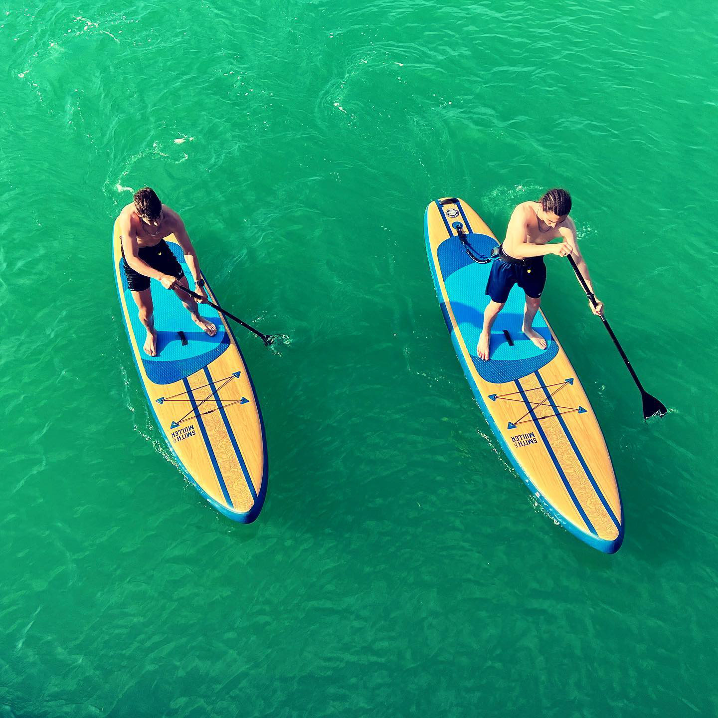
Graphic elements derived from wave patterns were developed to extend the identity onto the paddleboards themselves. These flowing forms create a sense of movement and energy, reinforcing the connection between the brand and the water environment.
Concept Development
Early exploration focused on translating traditional surf and ocean motifs into a contemporary graphic language. Sketches and visual studies informed the final mark, ensuring the identity remained both distinctive and scalable across different applications.

Logo - Monogram

Logo - portrait

Final Client concept before production

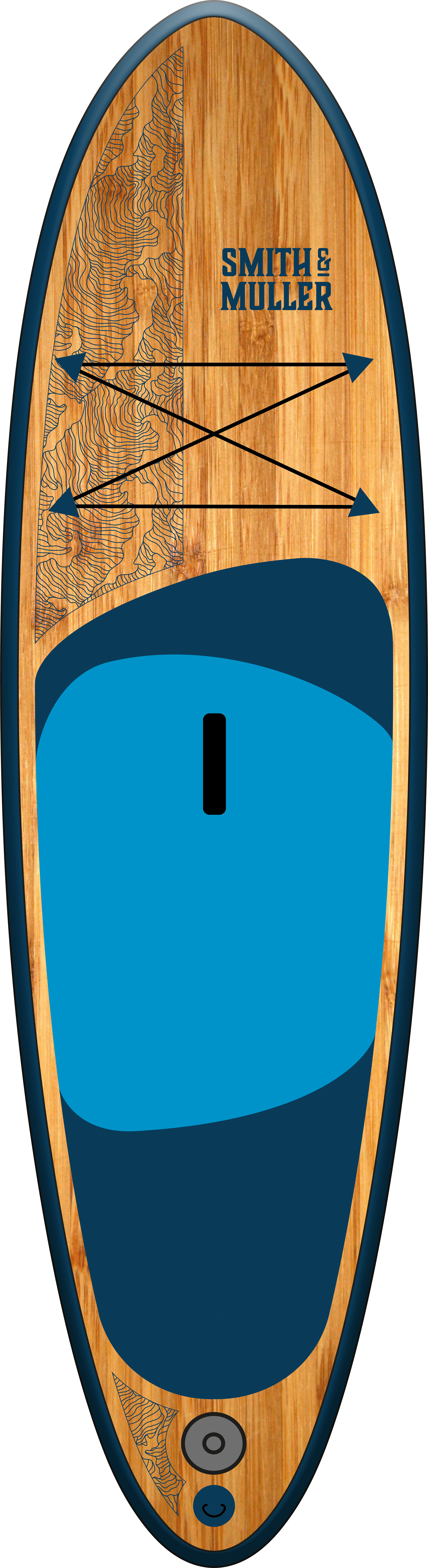
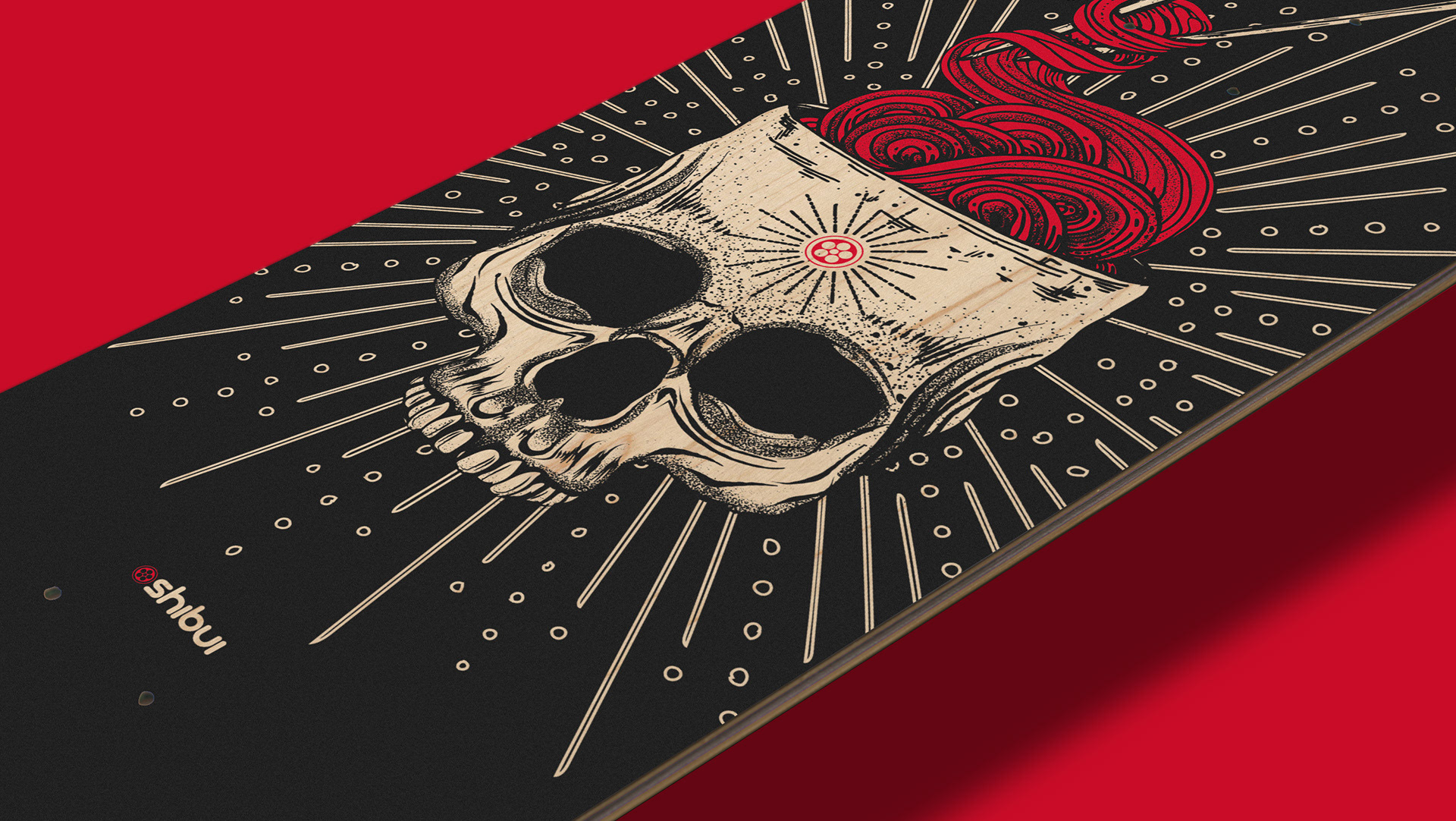
Project concept work